׳Khan׳
An identity redesign for the “Khan” theatre in Jerusalem
Silver winner of Indigo awards 2018
[Role] Concept lead, Strategy, Visual design
‘Bezalel’, Visual identity, 2010
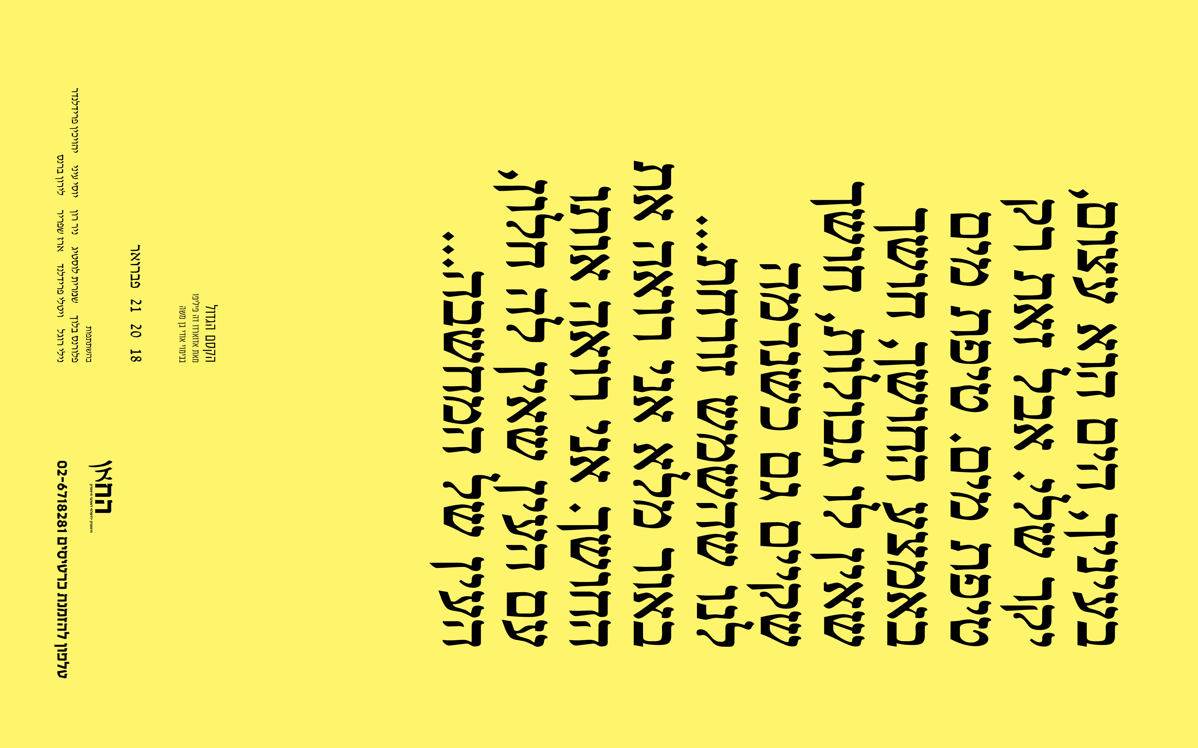
׳Khan׳ is a seasoned repertory theater in Jerusalem that has a fixed image in the local eye. The concept of the redesign was to take the conventional theatre perception and deconstruct it, both in the metaphysical (identity) and physical (material) level.
Concept
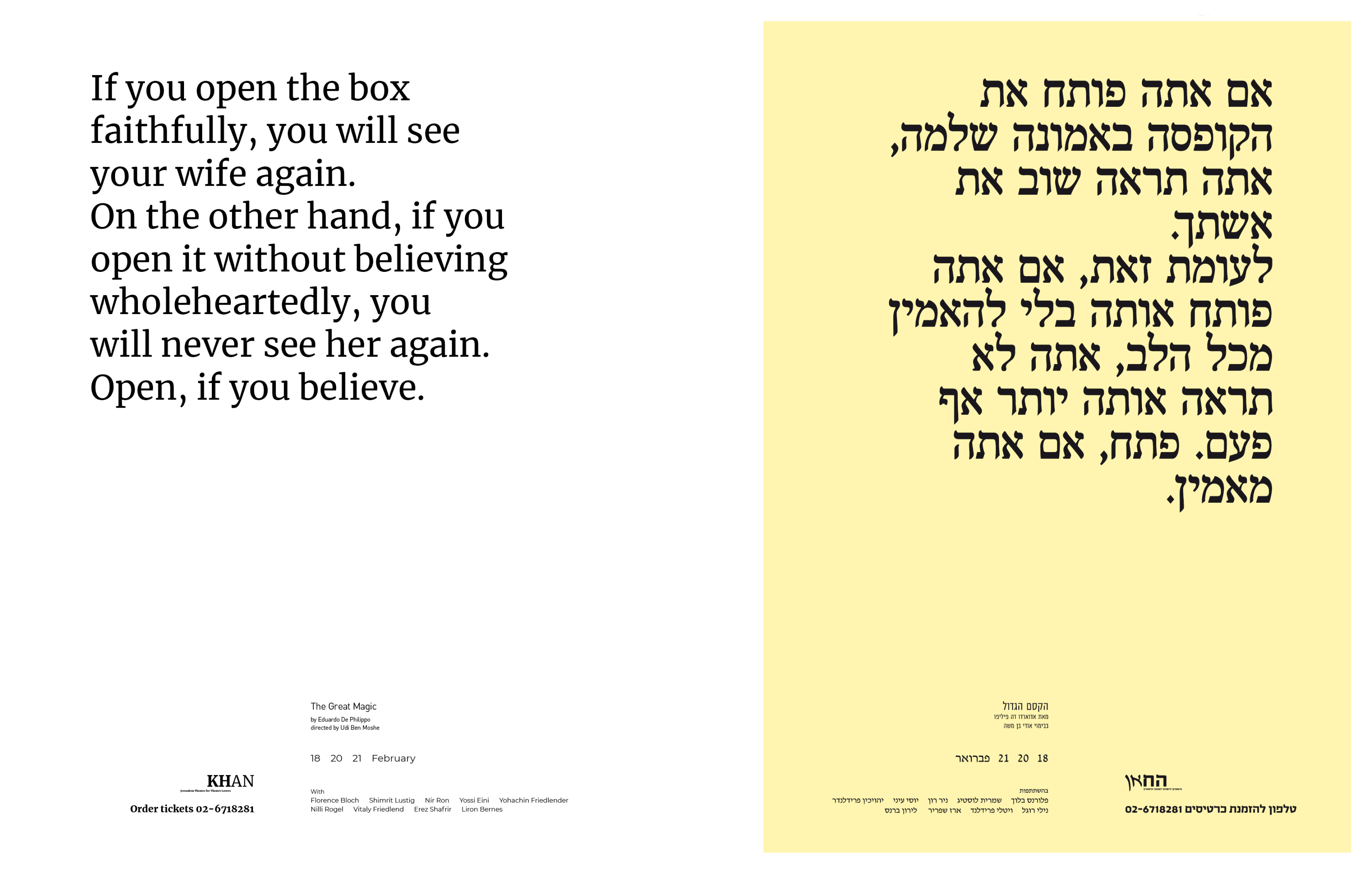
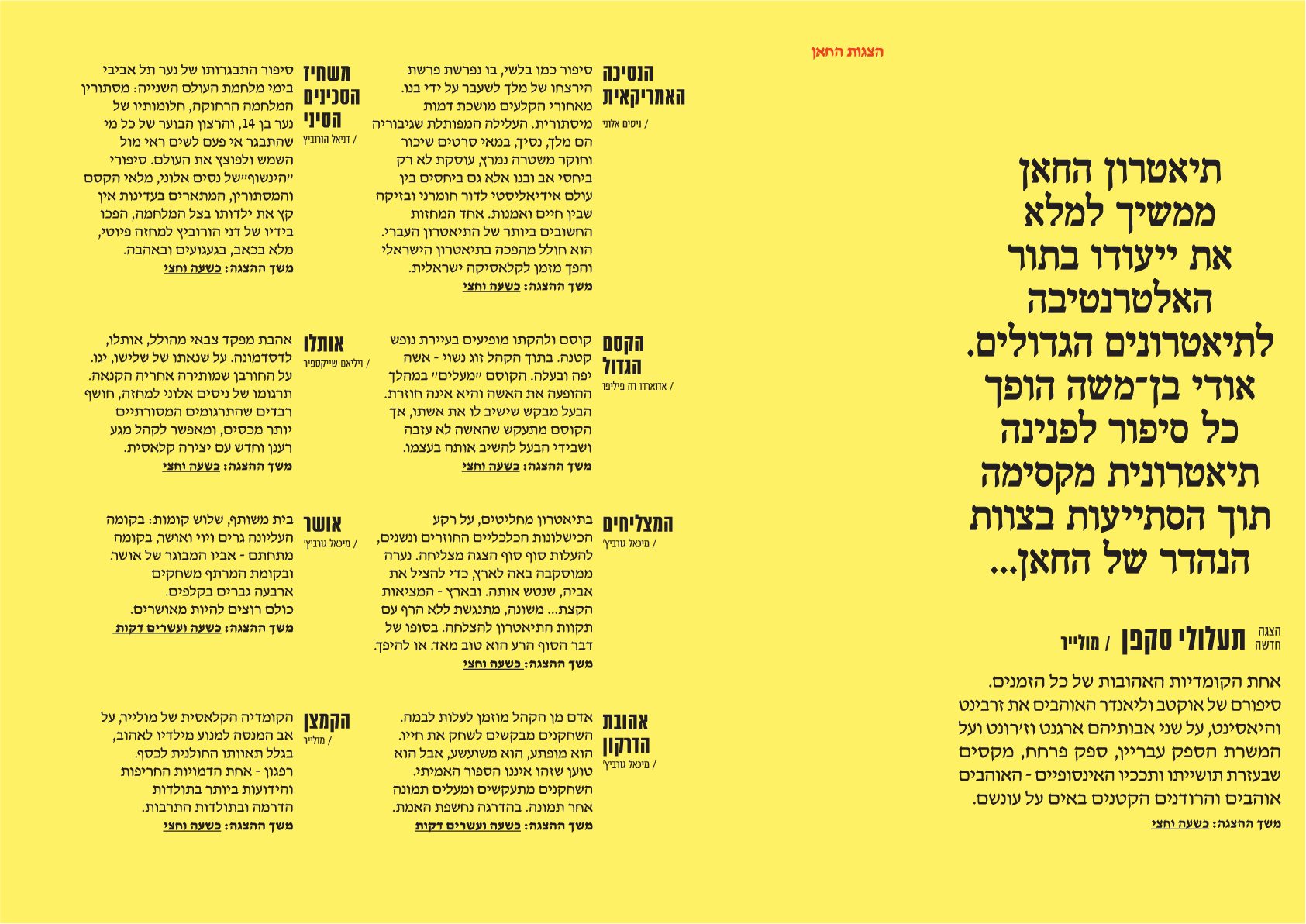
The theatre graphic design will now ׳speak׳ direct language to the audience - all imagery was replaced with actual textual content from the plays of the theatre: posters and play brochures were stripped down from any image or picture from the show and replaced with quotes and verbal information about the play.
The theatre graphic design will now ׳speak׳ direct language to the audience - all imagery was replaced with actual textual content from the plays of the theatre: posters and play brochures were stripped down from any image or picture from the show and replaced with quotes and verbal information about the play.
The word is the image and the content takes the front of the stage, consequently, enables personal interpretation of the play by visualization in the mind of the reader.




Manufacturing method
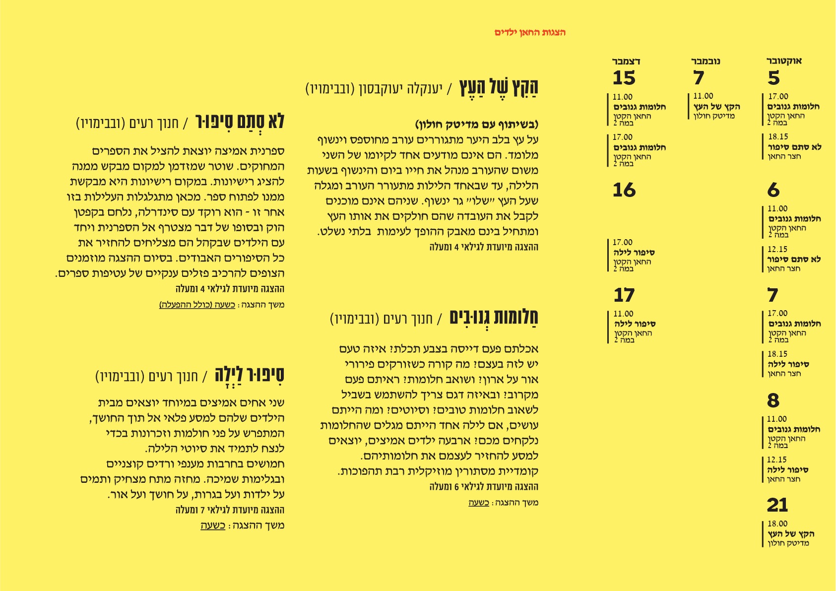
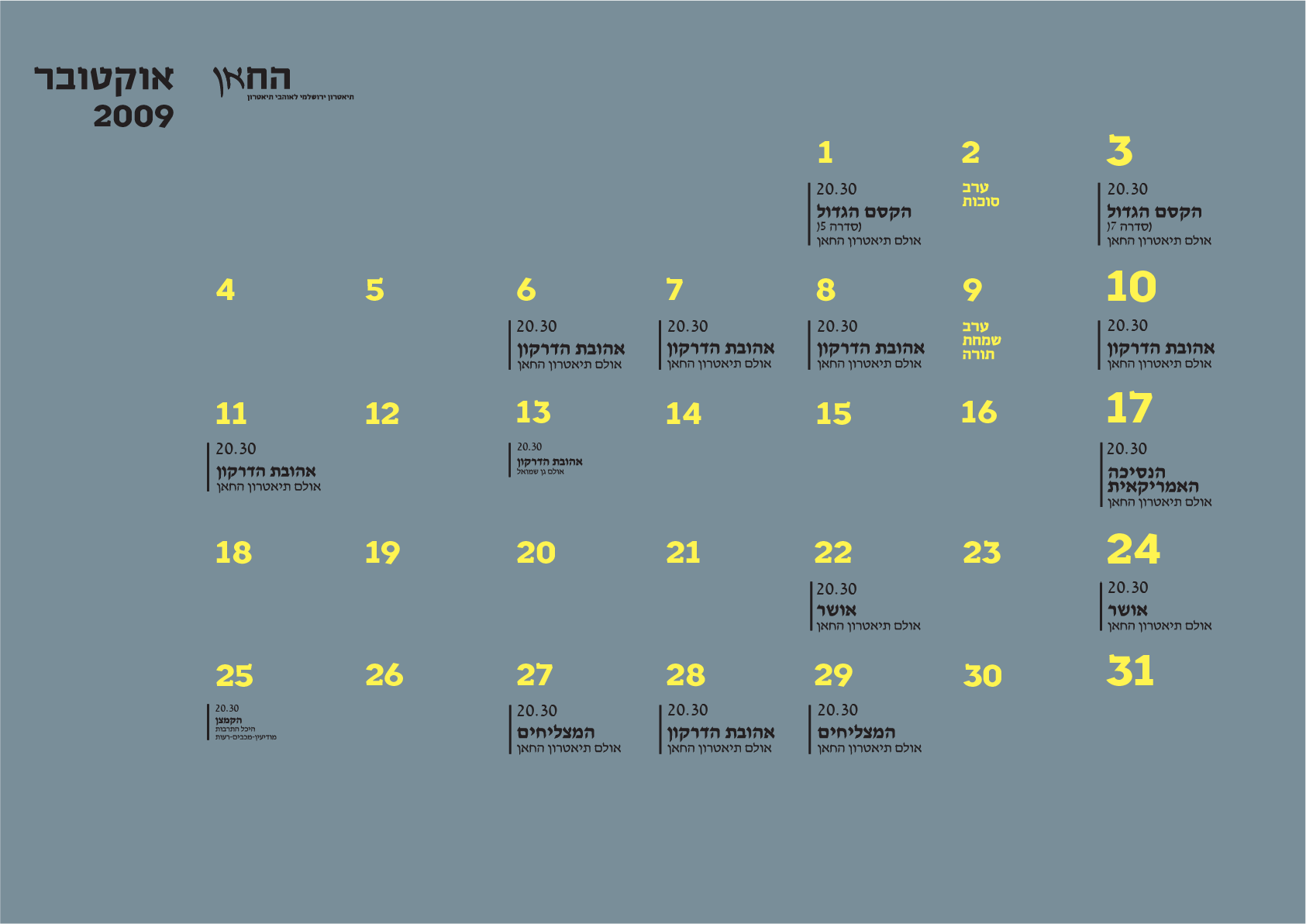
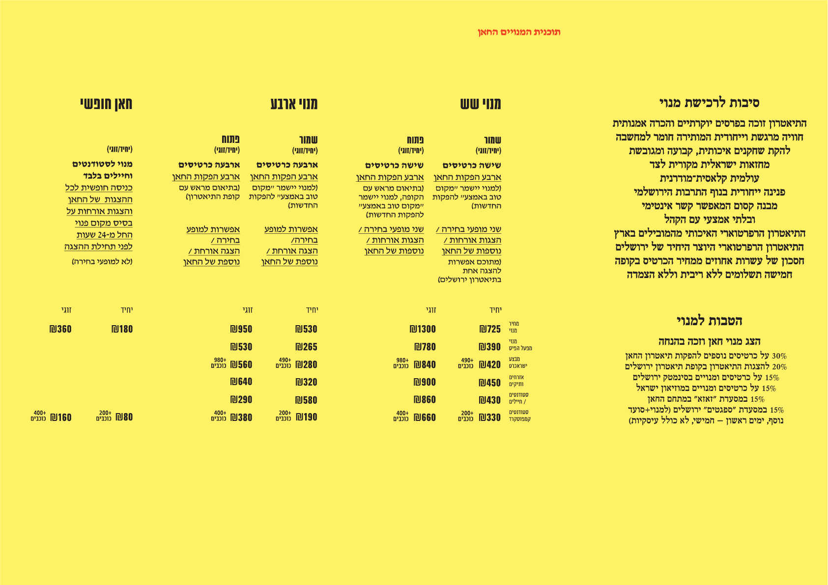
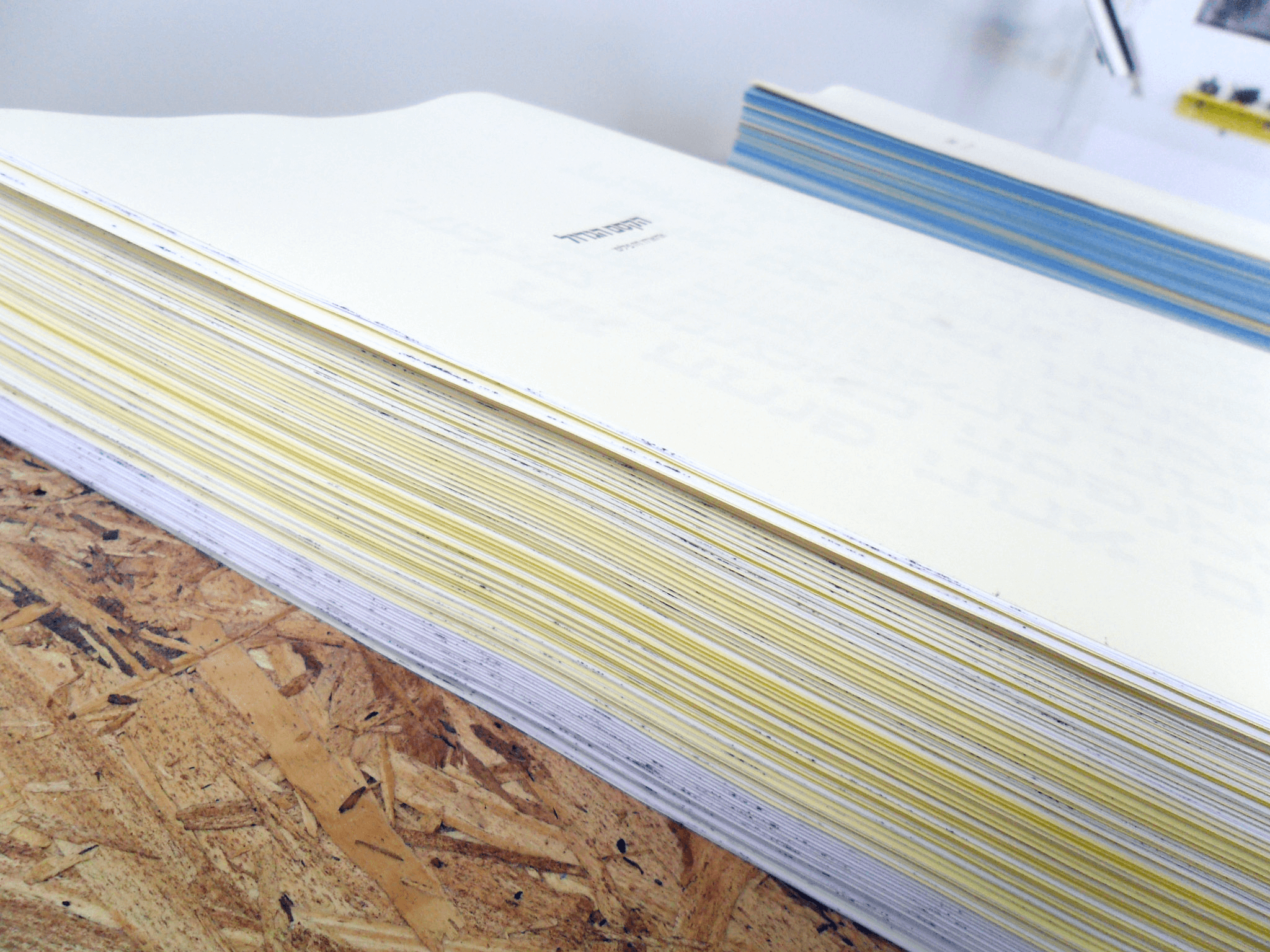
The printing materials were driven by the ׳what’s available in the print house׳ approach: standard A4 or A3 wood-free papers.
Form follows function
The printing materials were driven by the ׳what’s available in the print house׳ approach: standard A4 or A3 wood-free papers.
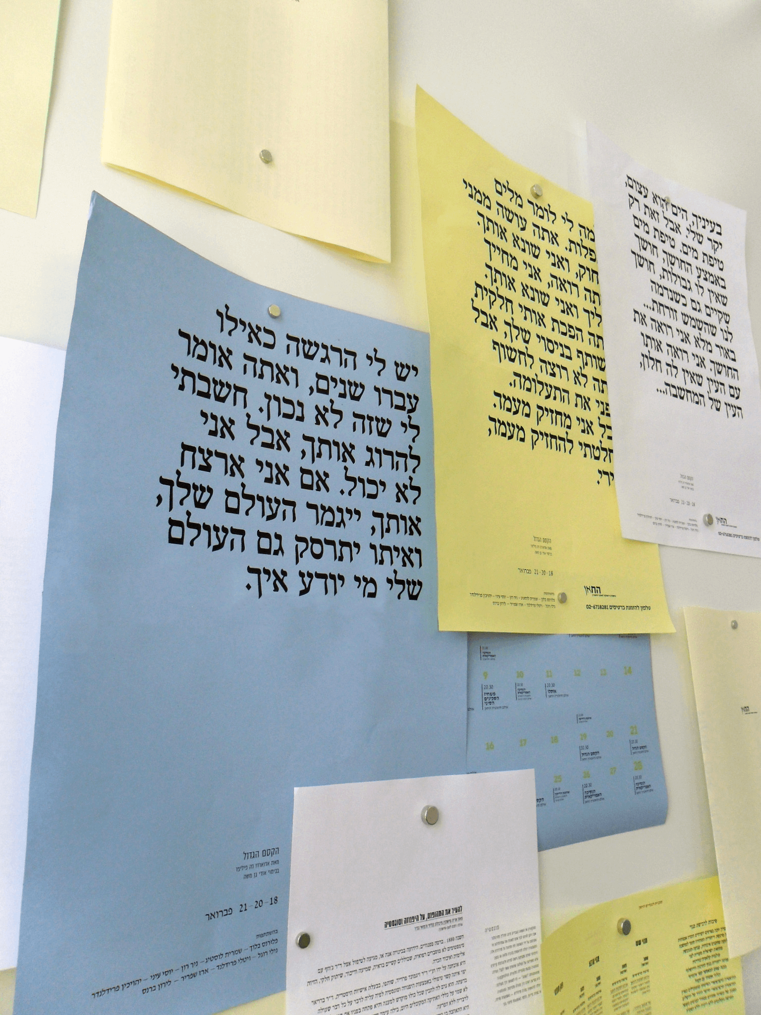
Same was applied to the color of the outputs - use what is available in the print house. This manufacturing approach set the structure of the printing materials as well: no more conventional brochures with paper clips or glue bindings. The outputs will now be ready made stand alone pages that are easy to handle and cost-efficient to print.
Form follows function
Various content types were fit to accommodate a single page (one sided print or two). Providing digestible content with the free choice of the type of content the viewers want to digest (what paper to pick and take, rather than receiving a pre-set brochure with the content already chosen for them).



Marketing
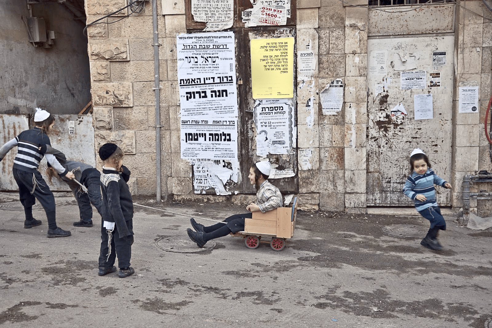
The materials and manufacturing enabled the marketing of the theatre on the street level, “lowering” the theatre from its high pedestal and making it more approachable.

