Digital Books Library
Experimental app for digital books, final graduation project
Silver winner of Indigo awards 2018
[Role] UX/UI design, Product definition
‘Bezalel’, App design, 2011

A library app for digital books. The library organizes the user’s book files in a visually informative way and reflects hers/his attributes as a reader.
Demo user flow of the Digital Library app
Layout
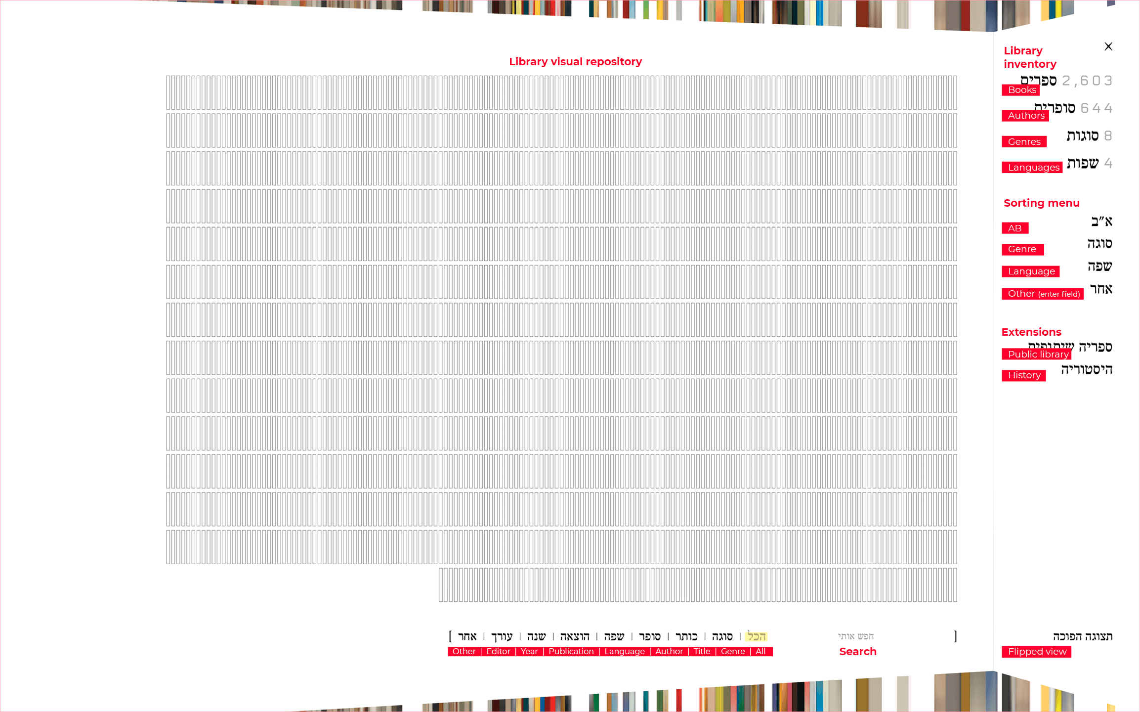
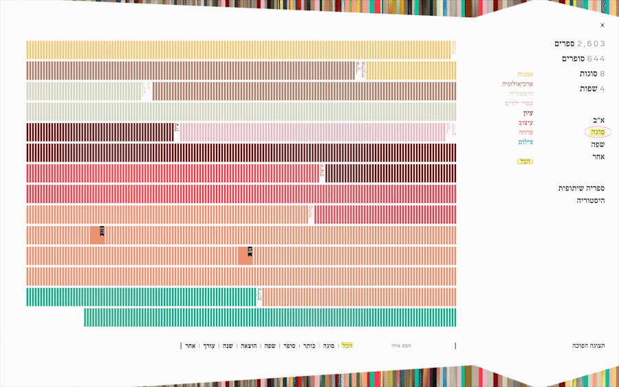
The default display presents the user’s library inventory (number of books, writers, genres and languages in the collection) and provides an easy sorting and organization menu.
The default display presents the user’s library inventory (number of books, writers, genres and languages in the collection) and provides an easy sorting and organization menu.
Each empty rectangle represents a book. The default book view is colorless to allow free color coding by preference.
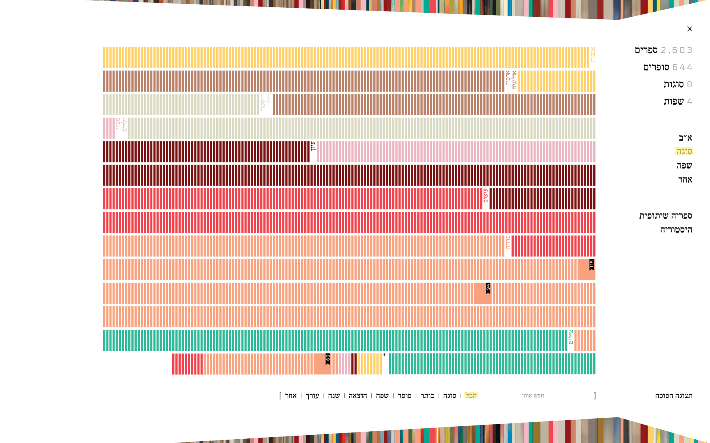
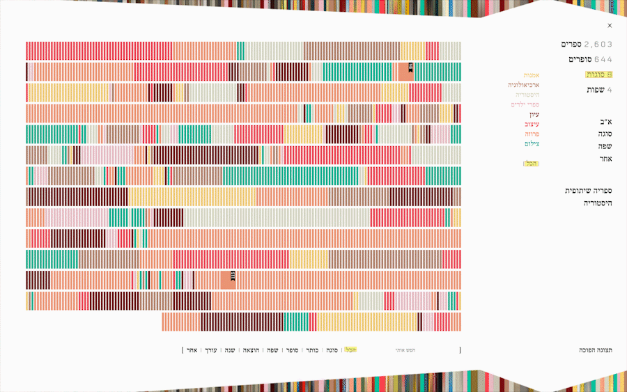
CustomizationUsers can organize their library by genres, languages and almost any given parameter (such as year of publication, publisher house etc.), and color code the books to distinguish between them by any preferable color customizable view.
Users can organize their library by genres, languages and almost any given parameter (such as year of publication, publisher house etc.), and color code the books to distinguish between them by any preferable color customizable view.
Color coding can be done by parameters such as genres, languages, authors etc. And sorting by AB orders, genres, languages and a free entry field.
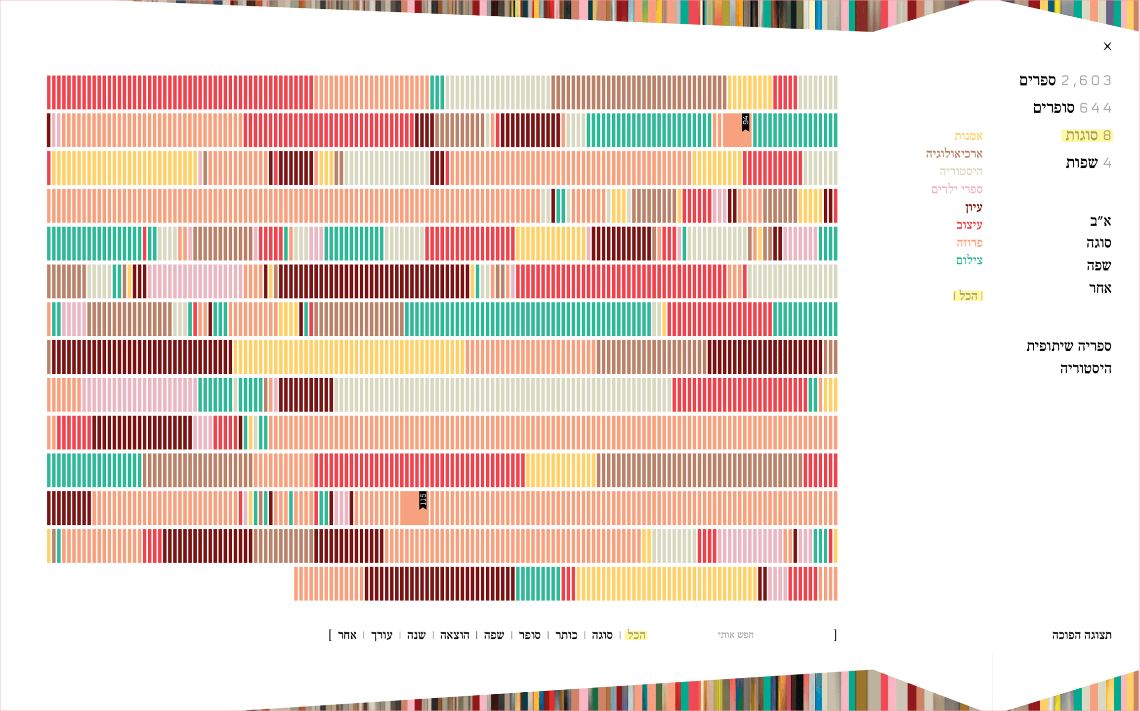


Trend trackingThe color and infographic nature of the library, allows the users to follow their inventory history by genres, languages etc. and form an individual graphic identity as a reader.
The color and infographic nature of the library, allows the users to follow their inventory history by genres, languages etc. and form an individual graphic identity as a reader.

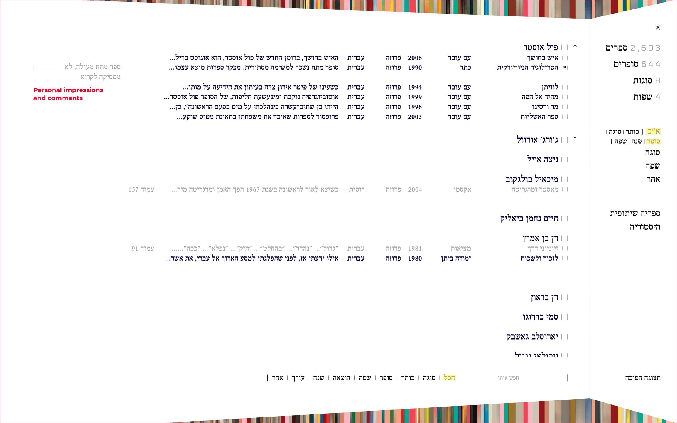
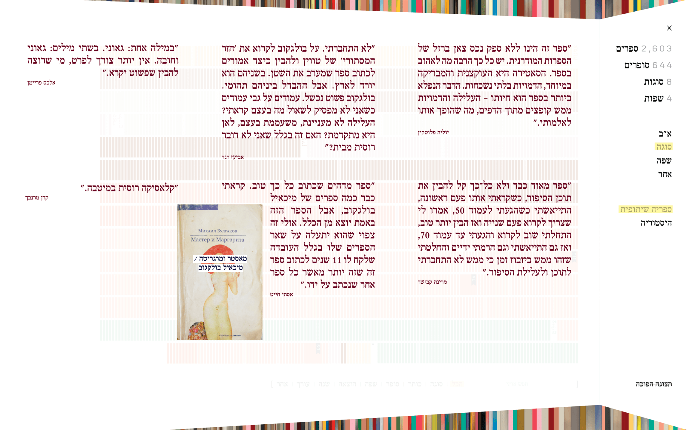
Social reading platform
Another aspect of the app is it’s potential to become a social platform in which you can share your impressions with your friends and hand in hand read theirs.
Another aspect of the app is it’s potential to become a social platform in which you can share your impressions with your friends and hand in hand read theirs.
In the ABC page, the users can enter their remarks and impressions of the book. Once turning the ׳Shared Library׳ view, their friend’s reviews and comments on shared books are displayed.
User interface
The app was designed in the Hebrew language for the Hebrew speaking user to allow full personalization. Moreover, the app follows the literary spirit by avoiding icons and images in all UI components.
(Scroll bars, color assignment UI, menu pane, search component, etc.)
The app was designed in the Hebrew language for the Hebrew speaking user to allow full personalization. Moreover, the app follows the literary spirit by avoiding icons and images in all UI components.
Elements such as indicators and navigation are font originated and typography based. In the design process most icon and image based UI standards were deliberately avoided and replaced by words and text.
(Scroll bars, color assignment UI, menu pane, search component, etc.)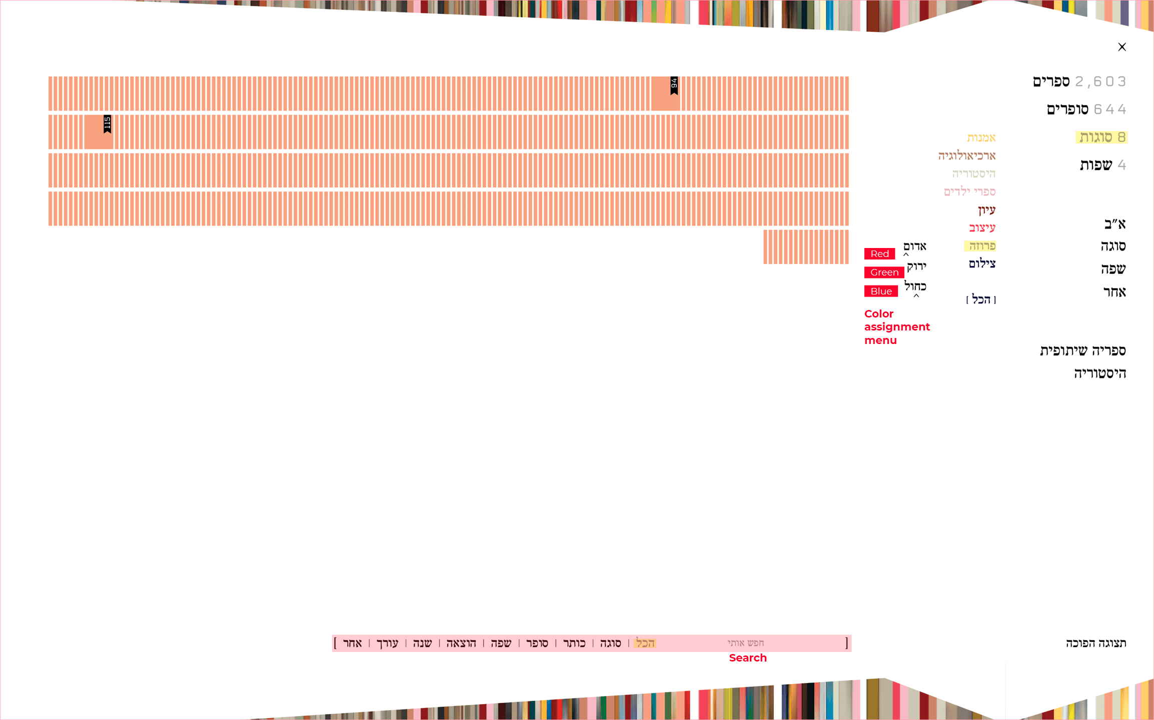


Navigation
Elements from the physical literature realm were metaphorically applied in the layout and navigation design, to follow the reading tradition and concept.
Elements from the physical literature realm were metaphorically applied in the layout and navigation design, to follow the reading tradition and concept.
The app’s screens and menus were created to hint a blank piece of paper.
The navigation animations were inspired by the action of ׳flipping/turning a page׳.
The navigation panes’ structure was driven from the concept of ׳a folded paper׳.
Flipped View
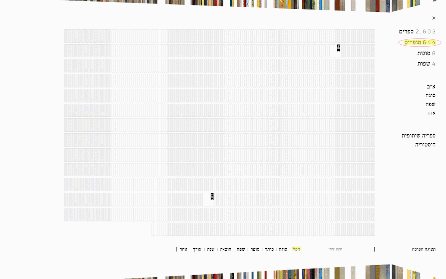
The app’s default view is the ׳blank library׳ - the user’s book collection is displayed as colorless rectangles, sorted initially alphabetically.
The default view is a platform for a potential color coding as a method of sort and management.
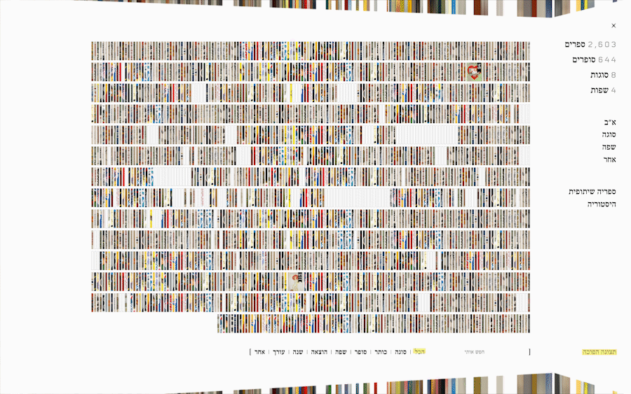
Each rectangle in the UI represents a book file. Some of the files contain in them the book’s original front cover image. By flipping the main view, the users can explore their library from the
image perspective.
Flipped View
The app’s default view is the ׳blank library׳ - the user’s book collection is displayed as colorless rectangles, sorted initially alphabetically.
The default view is a platform for a potential color coding as a method of sort and management.
Each rectangle in the UI represents a book file. Some of the files contain in them the book’s original front cover image. By flipping the main view, the users can explore their library from the image perspective.
User unique reading identity
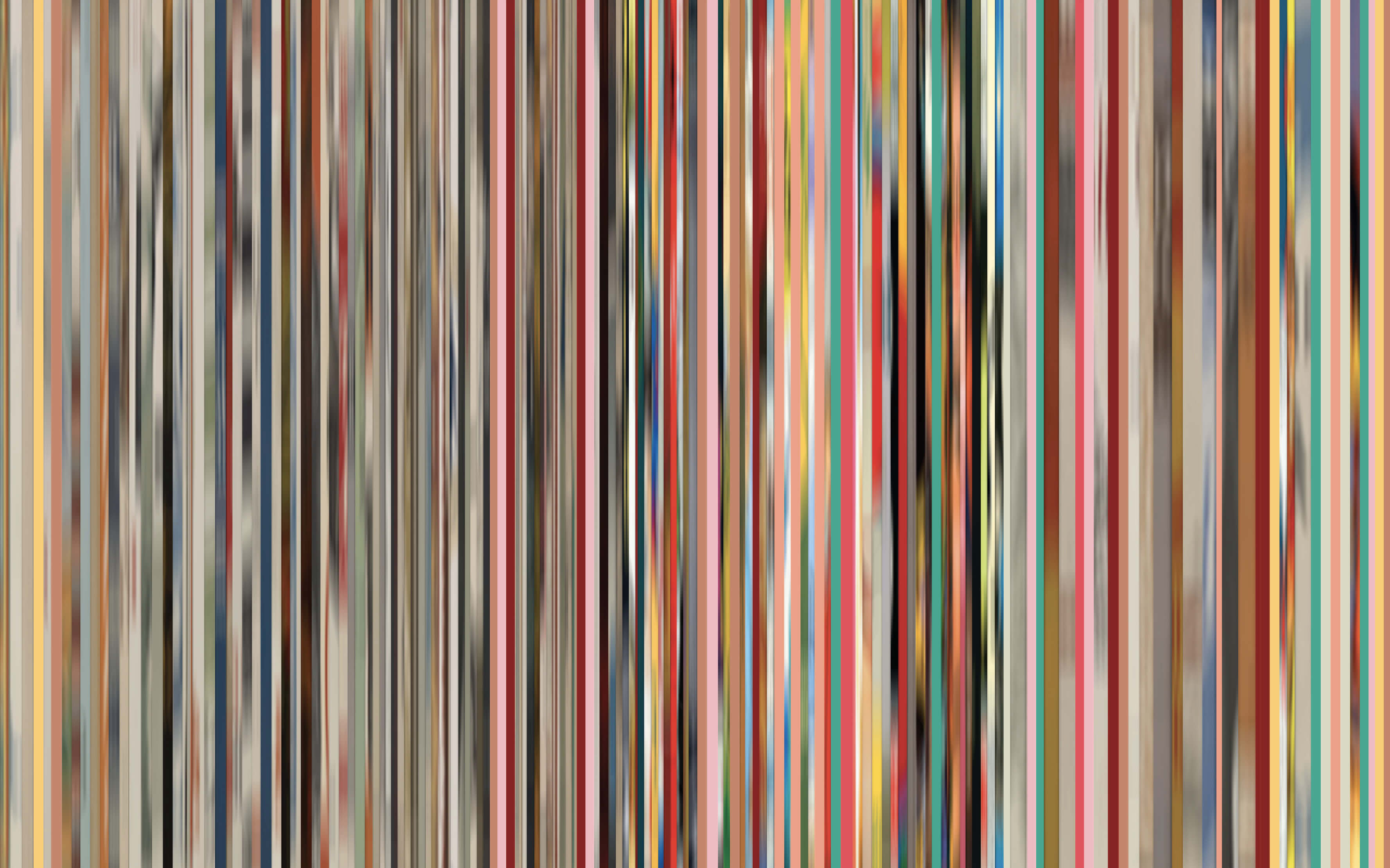
The colors the user chooses for color coding and the parameters upon which the user chooses to color code - are reflected in the background image of the library and create a unique “barcode” that distinguishes the user identity from other readers.
The colors the user chooses for color coding and the parameters upon which the user chooses to color code - are reflected in the background image of the library and create a unique “barcode” that distinguishes the user identity from other readers.
The library background is an image that consists of a collection of rectangle stretched fragments of the book’s front covers. Books that are downloaded as files without the original cover images are represented as white (׳colorless׳) rectangles.
Once the users color-code their books the ׳colorless׳ rectangles are colored in the background according to the color the users choose. Consequently, the image in the app’s background is compiled of a mixture of the ׳original׳ book stretched covers and the colors the users color codes their inventory. Each app background image is unique to that specific user since it reflects their book collection and color choices - thus creating a custom-personalized barcode of the user as a reader.
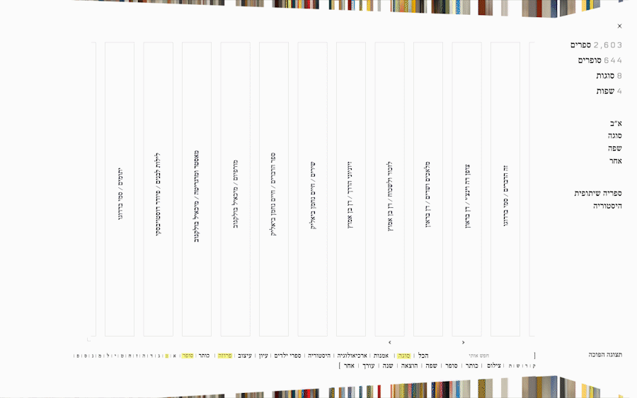
Exploration
While working on the project, I’ve tested various graphic forms, before achieving the final concept.
While working on the project, I’ve tested various graphic forms, before achieving the final concept.
Diamond
Each side of the shape represents a different language, can be sorted by color genres and morf to a different shape to represents user's sorting preferences.

Shelves
Sorted by colour genres, can be rearranged to layers that reflect the distribution by languages.


Cube
Each book is displayed as a square, can be sorted by colour genres, and distributed to columns that represents a different language.

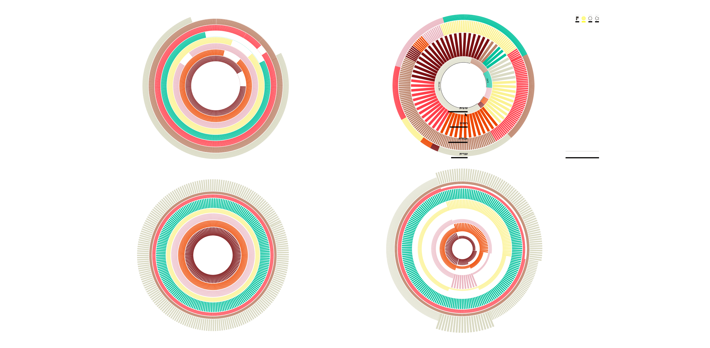
Turbine
Each circle is a genre, can be sorted by colour genres and languages.
On the left: each circle is a different language.
On the right: each circle is a genre and language combined.
Freestyle
Exhibits the mutual reference fields of all the books in the library, while the color coding represents the genres.
