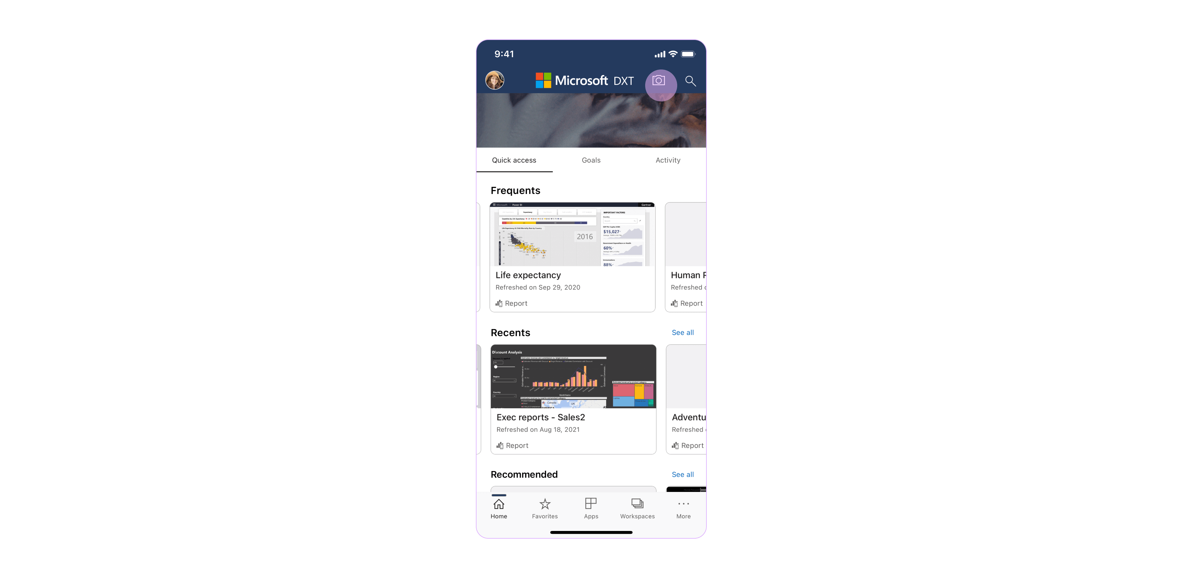
Data in Space
Data and insights in the physical space
[Role] Lead product designer, Experience definition
Power BI, AR design, 2020-Present


Data in Space is an augmented reality experience that enables users to make better decisions based on data and insights outside of the office boundaries, in places, and next to objects/people in the physical world.
It does so through the ability to bind data to a real-world object as a digital twin, place and save it in the physical space.
Data in Space POC Demo flow: Pinning and scanning Covid-19 vaccine data to track vaccination progress in the Seattle vaccination center.
Vision and MotivationOne of Power BI key objectives is to help
customers drive a data culture, where every
employee in the organization has an immediate access
to data and insights and is making decisions based on facts versus
opinions. In mobile, this vision can be achieved through new technologies and capabilities like Augmented Reality.
Vision and Motivation
︎
Augmented Reality in BusinessAugmented
Reality in mobile devices has matured and gained serious momentum in the last
years. Utilizing this technology to empower the Power BI user seems like a natural extension to further the product vision.
(Read “10 Augmented Reality Trends in 2021: The future is Here” for more insights).Augmented Reality in Business
︎
The definition process began with the collection of user research, customers studies and potential needs/scenarios, upon which we could build flows and solidify requirements.
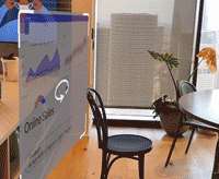
![Retail industry "Data in Space" use case. Taken from Microsoft internal research.]()
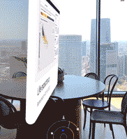
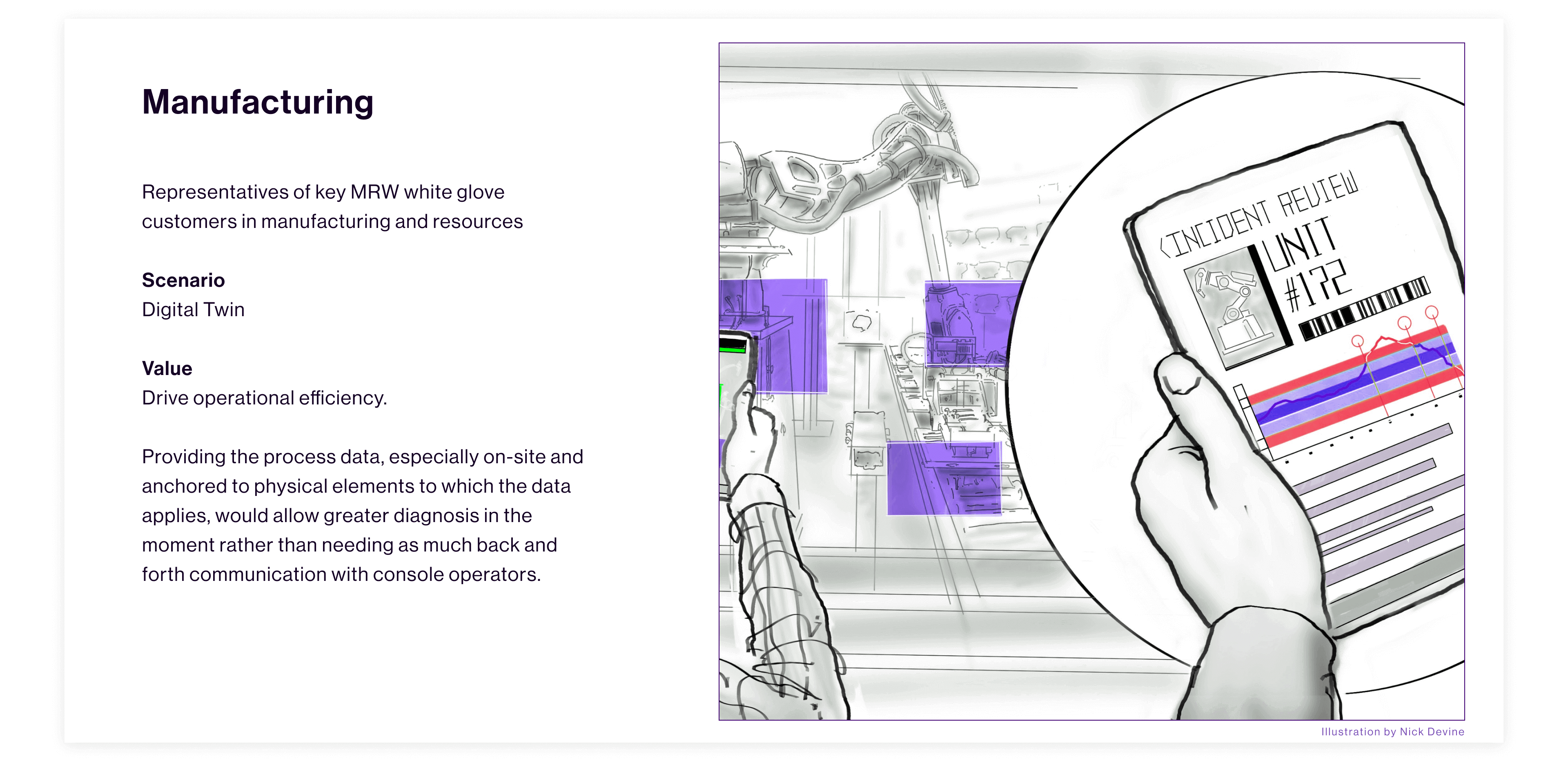
![Manufacturing industry "Data in Space" use case. Taken from Microsoft internal research, 01.]()
![Manufacturing industry "Data in Space" use case. Taken from Microsoft internal research, 02.]()
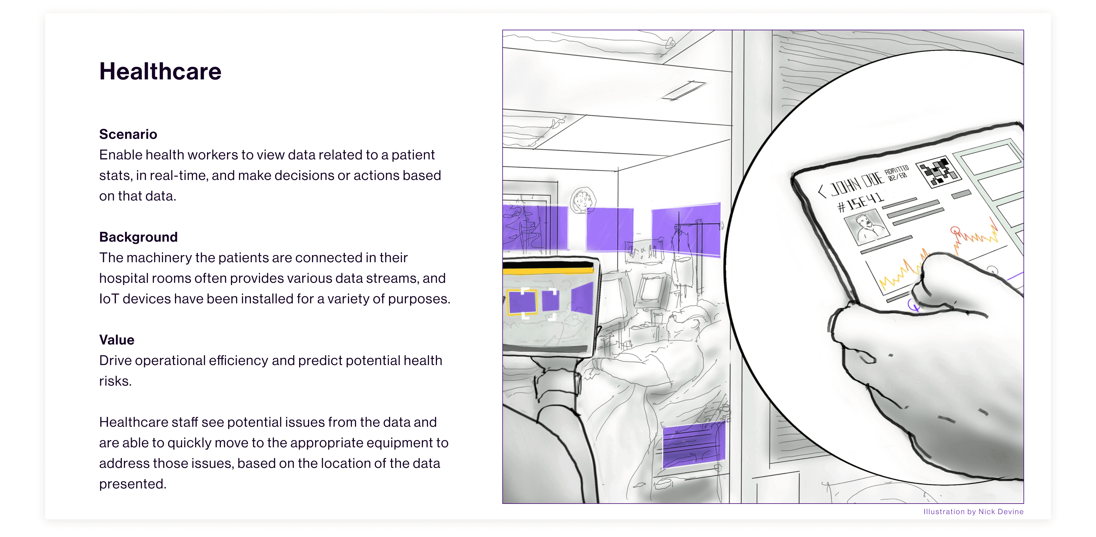
![Healthcare industry "Data in Space" use case. Taken from Microsoft internal research.]()
Use Cases
Data in Space
The definition process began with the collection of user research, customers studies and potential needs/scenarios, upon which we could build flows and solidify requirements.
We approached companies from different industries: Retail, Manufacturing, Construction, Healthcare, etc... and asked questions like: Does it make sense? What is the addressable market? What are the business scenarios?


Key takeaways
- The business need for ׳Data in Space׳ exists.
- Many customer scenarios require near real-time data.
- Two personas emerged:
The creator who pins the reports in the space.
The consumer who scans and discovers the items in space.
The consumer who scans and discovers the items in space.
︎
Flow Conceptualization
Core experience elements of ׳Data in Space׳, were rooted in real customers needs, which guided me through the conceptualization of the basic ׳Pinning׳ and ׳Scanning׳ flows.
The creator, pins the reports in the relevant space. For instance, the assembly line manager, pins a report of the parts inventory next to its line.
Later on the consumer, the assembly line worker, can scan the space to find the report and understand the inventory in context of his/hers needs.

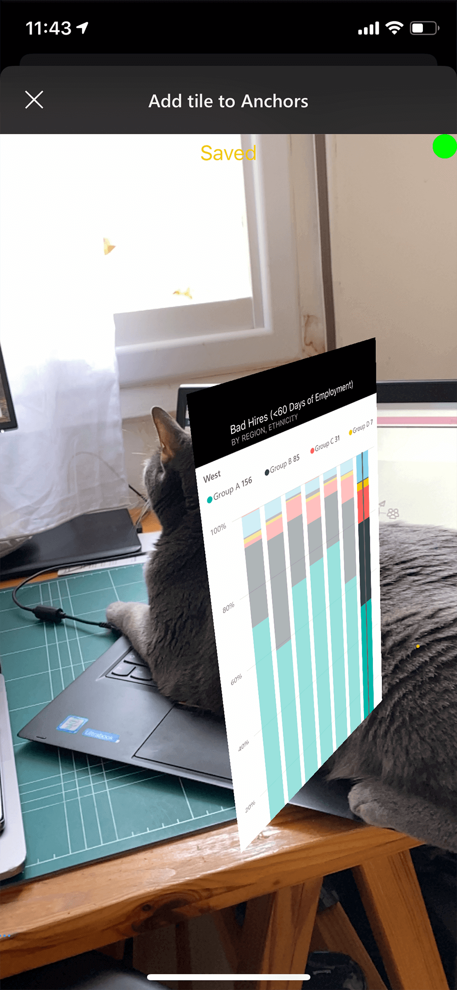
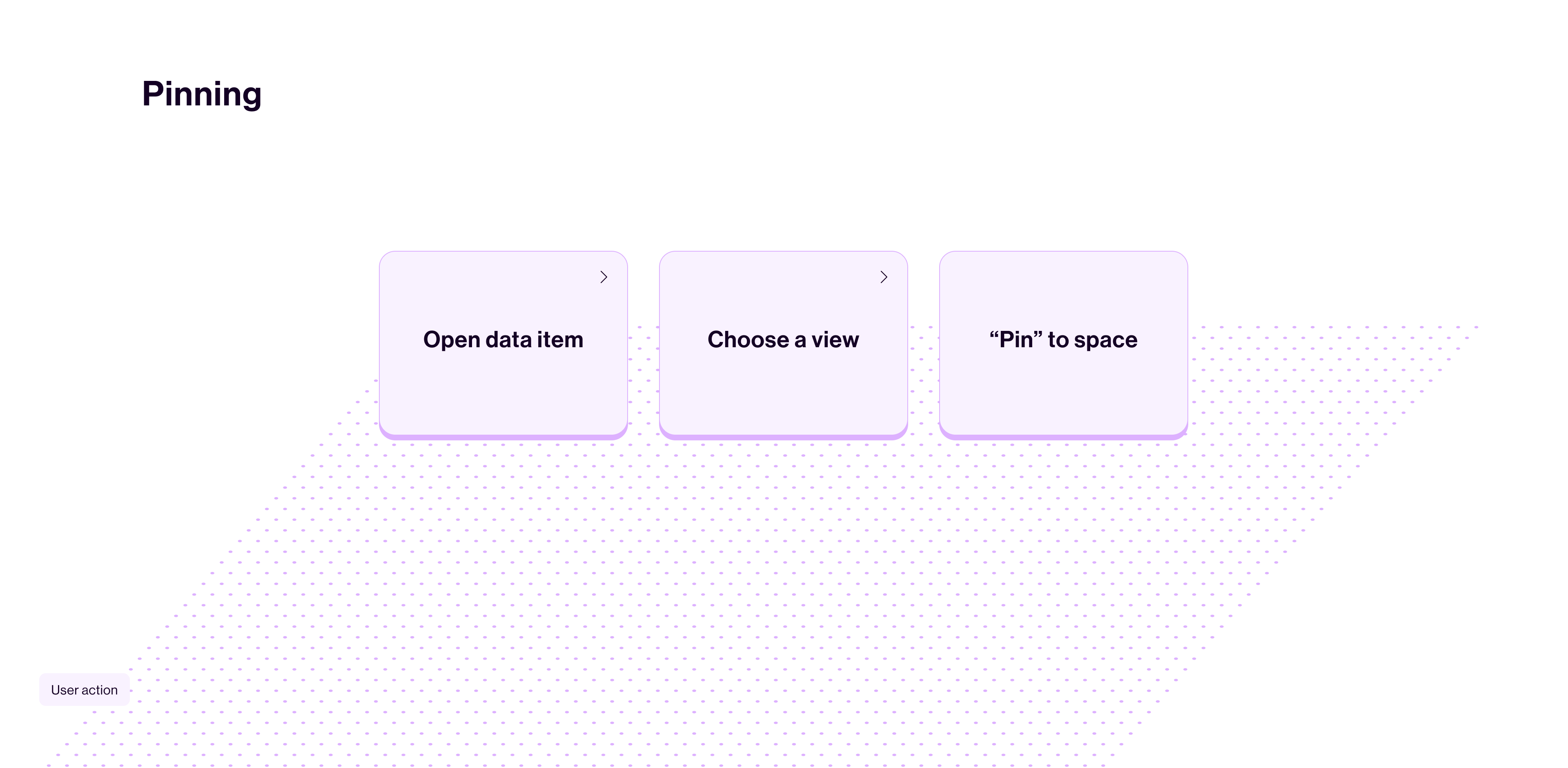
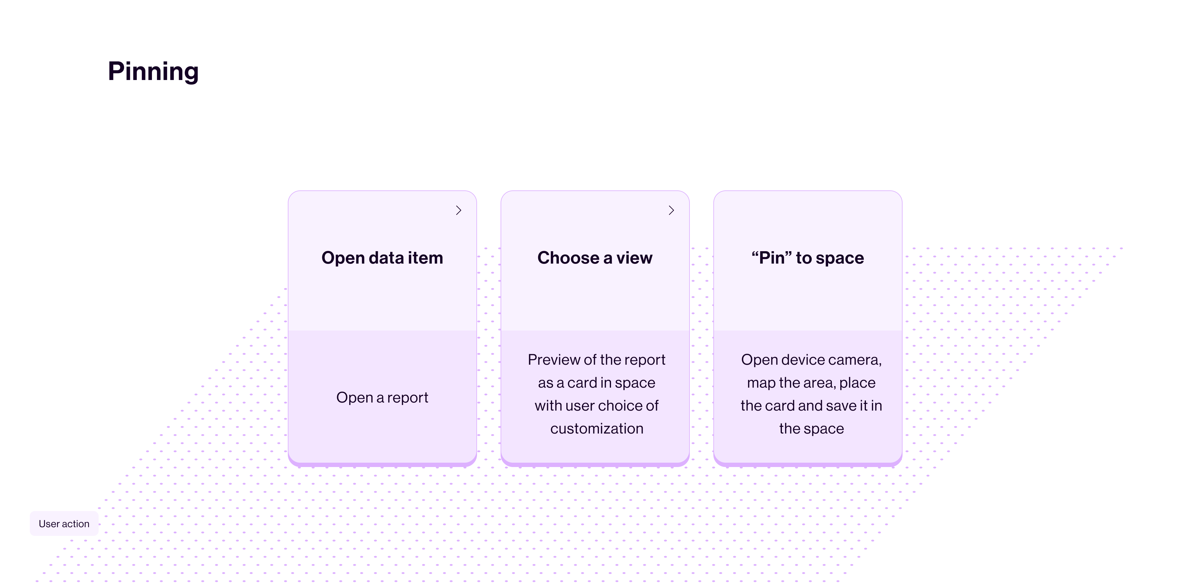
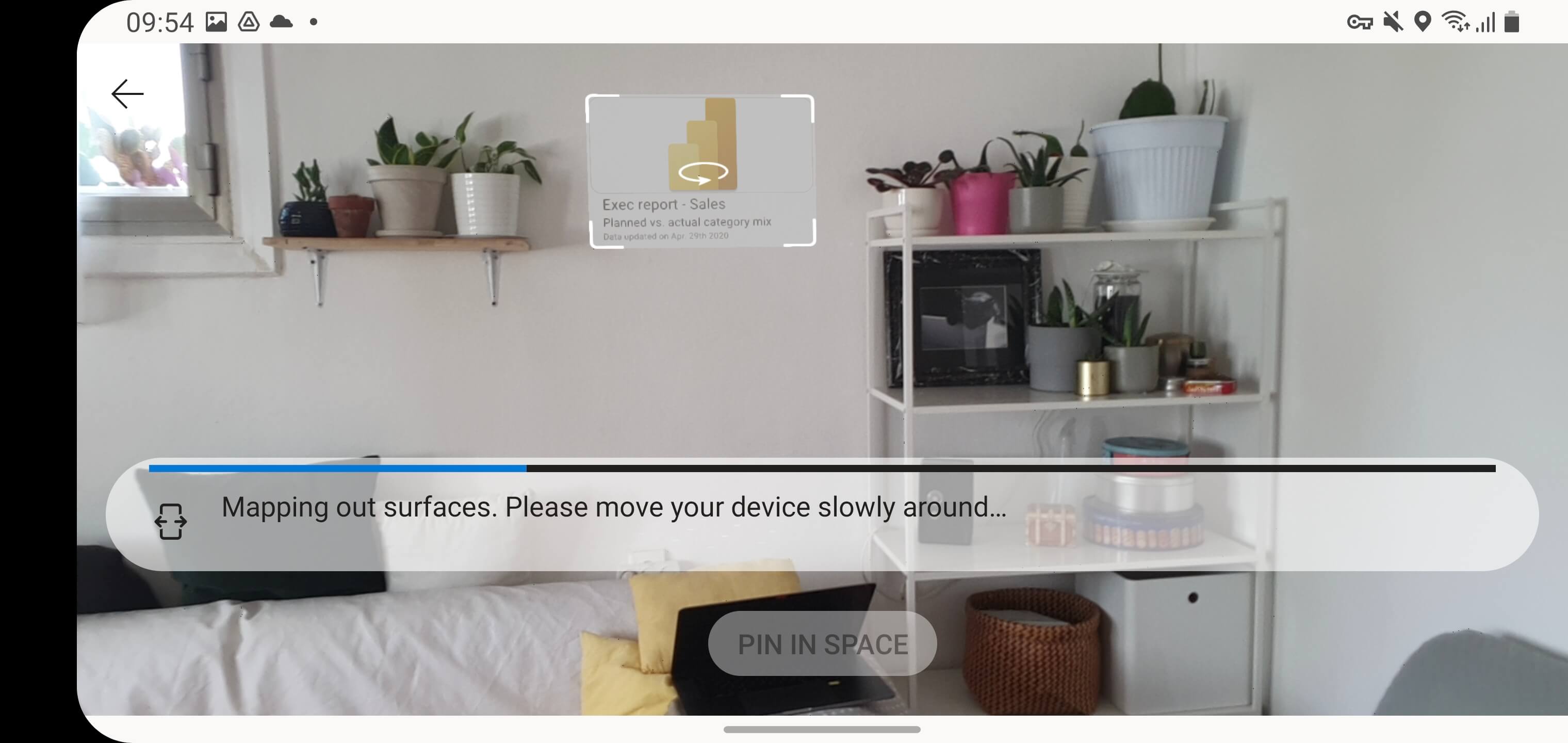
Pinning
Data in Space
Data in Space Pinning flow: Placing a report in a Gym. The user places the “Cardio” report next to the cardio equipment in the Gym.
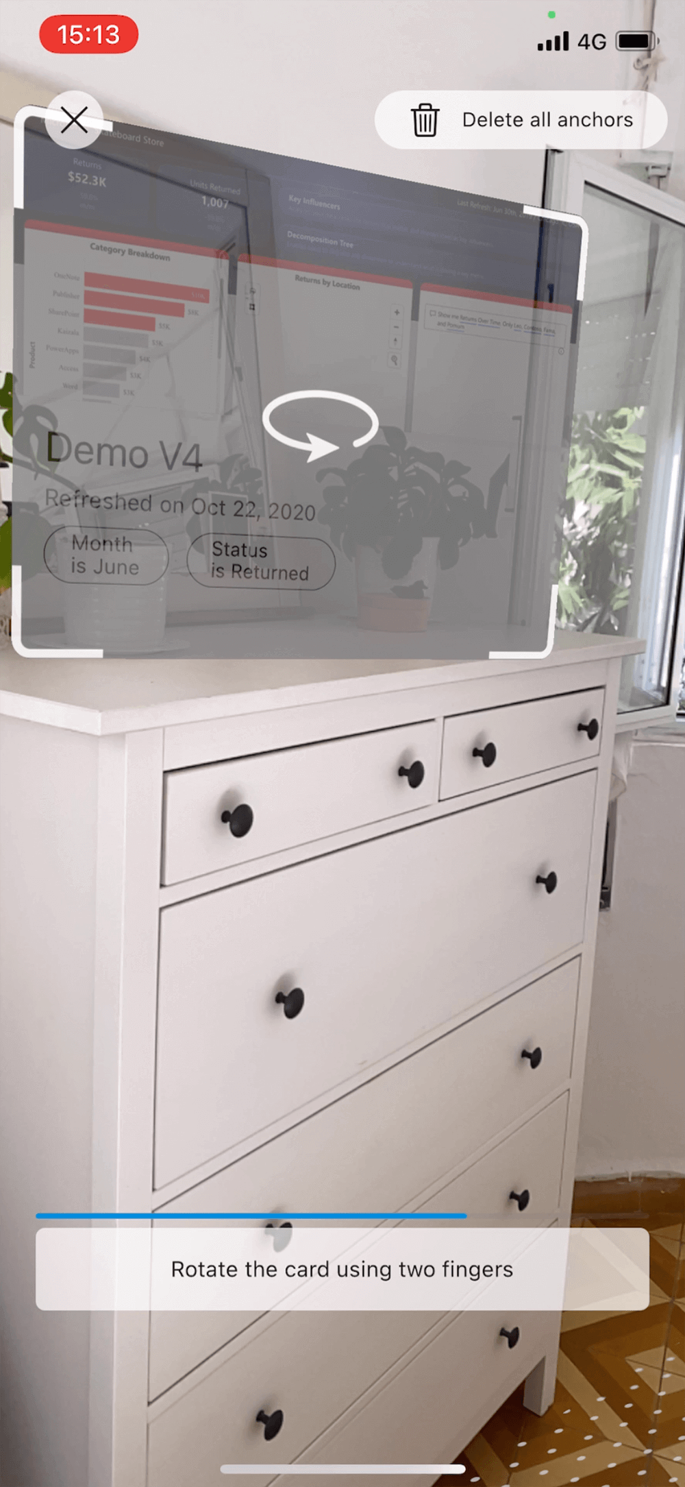
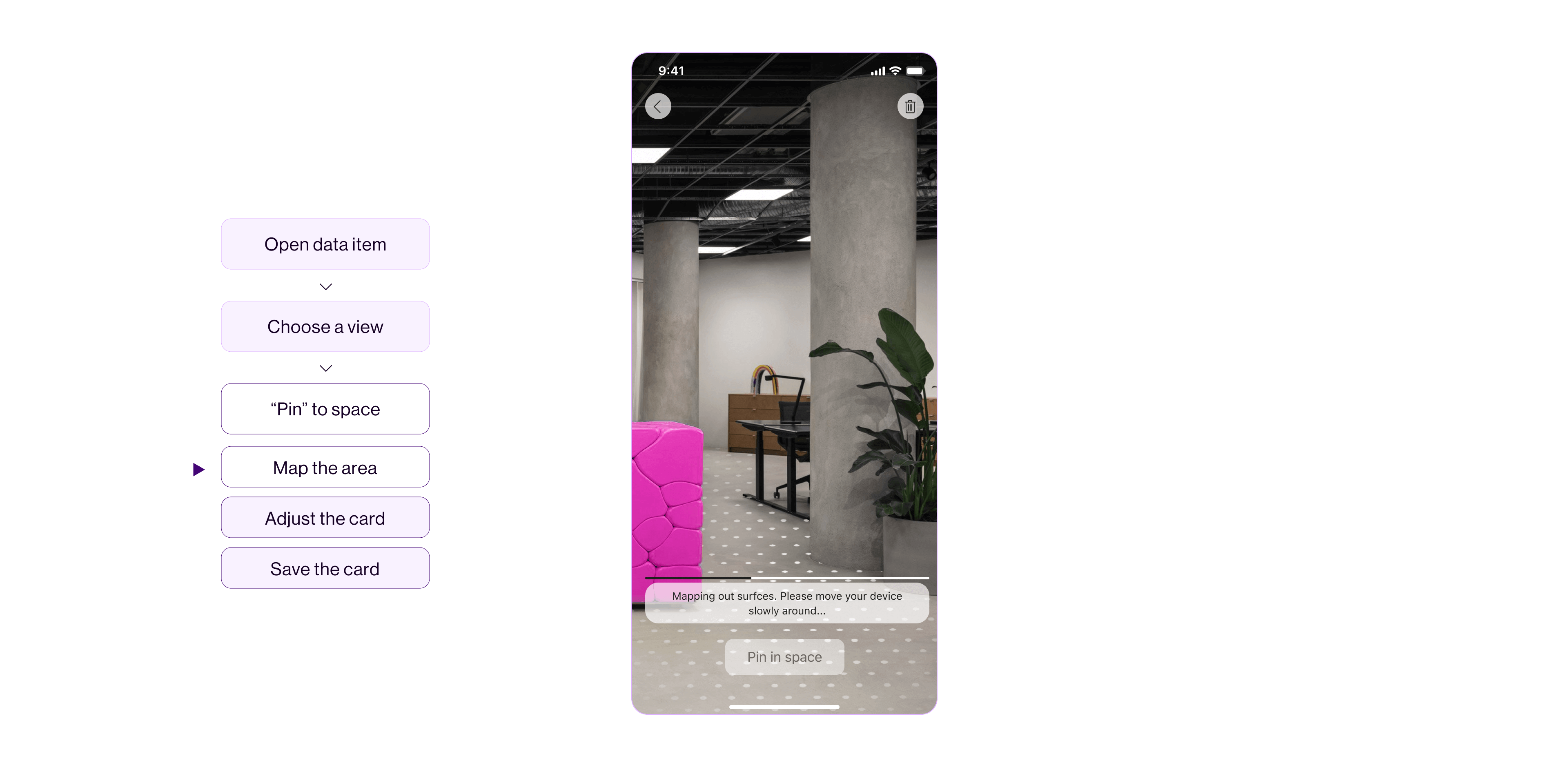
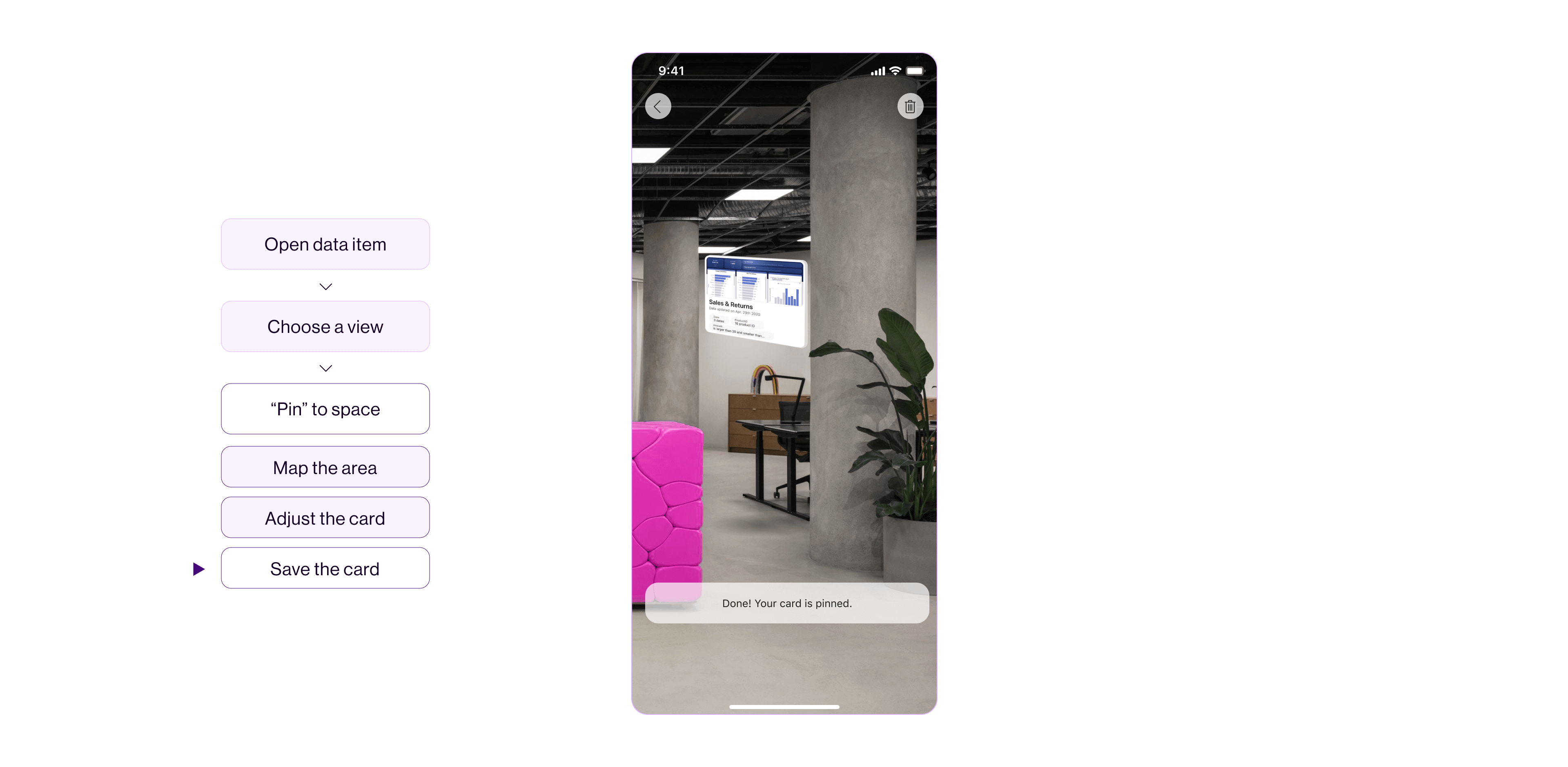
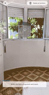
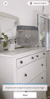
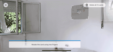
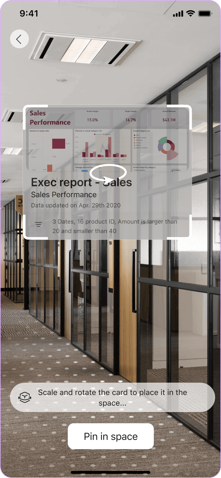
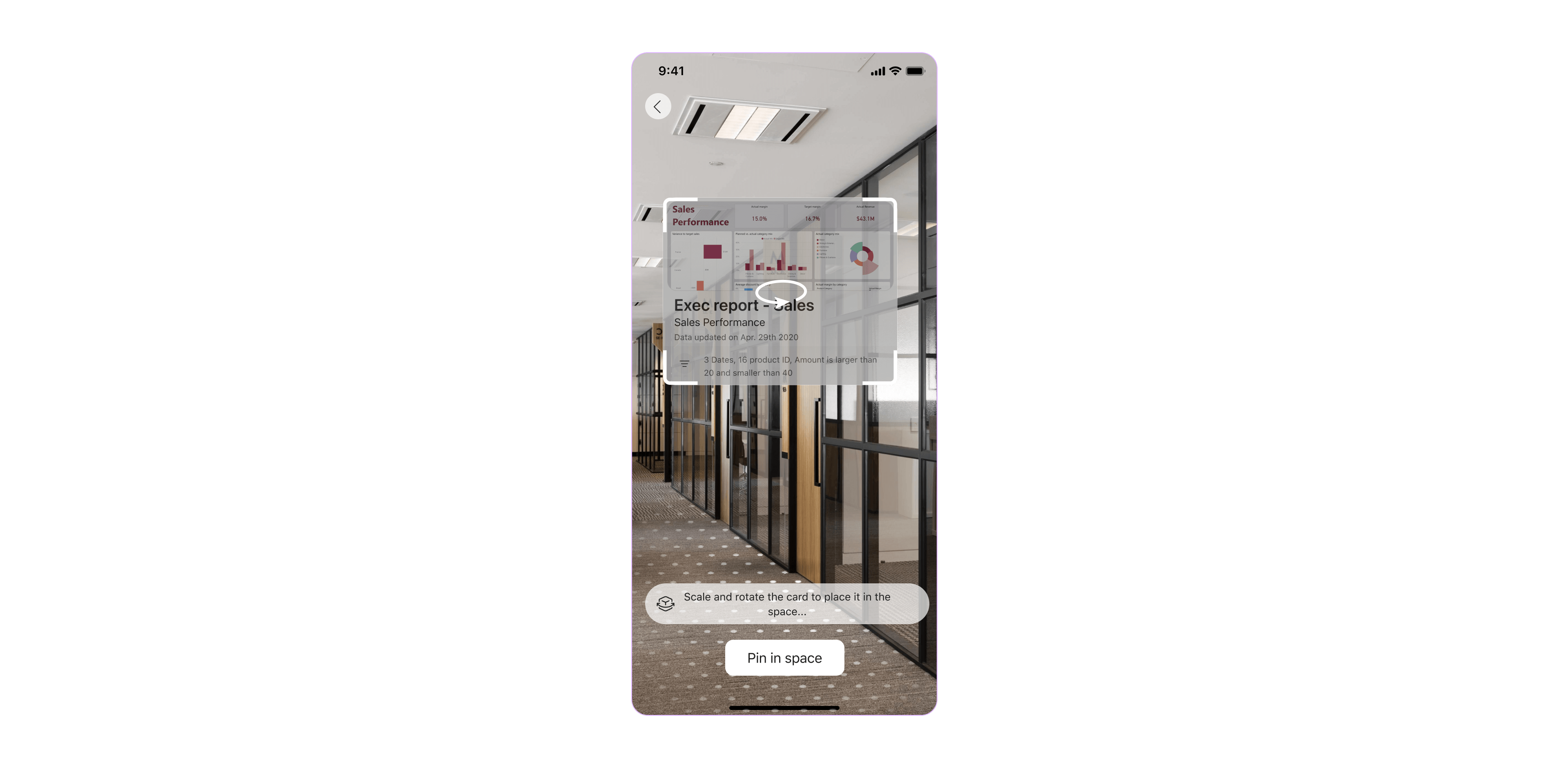
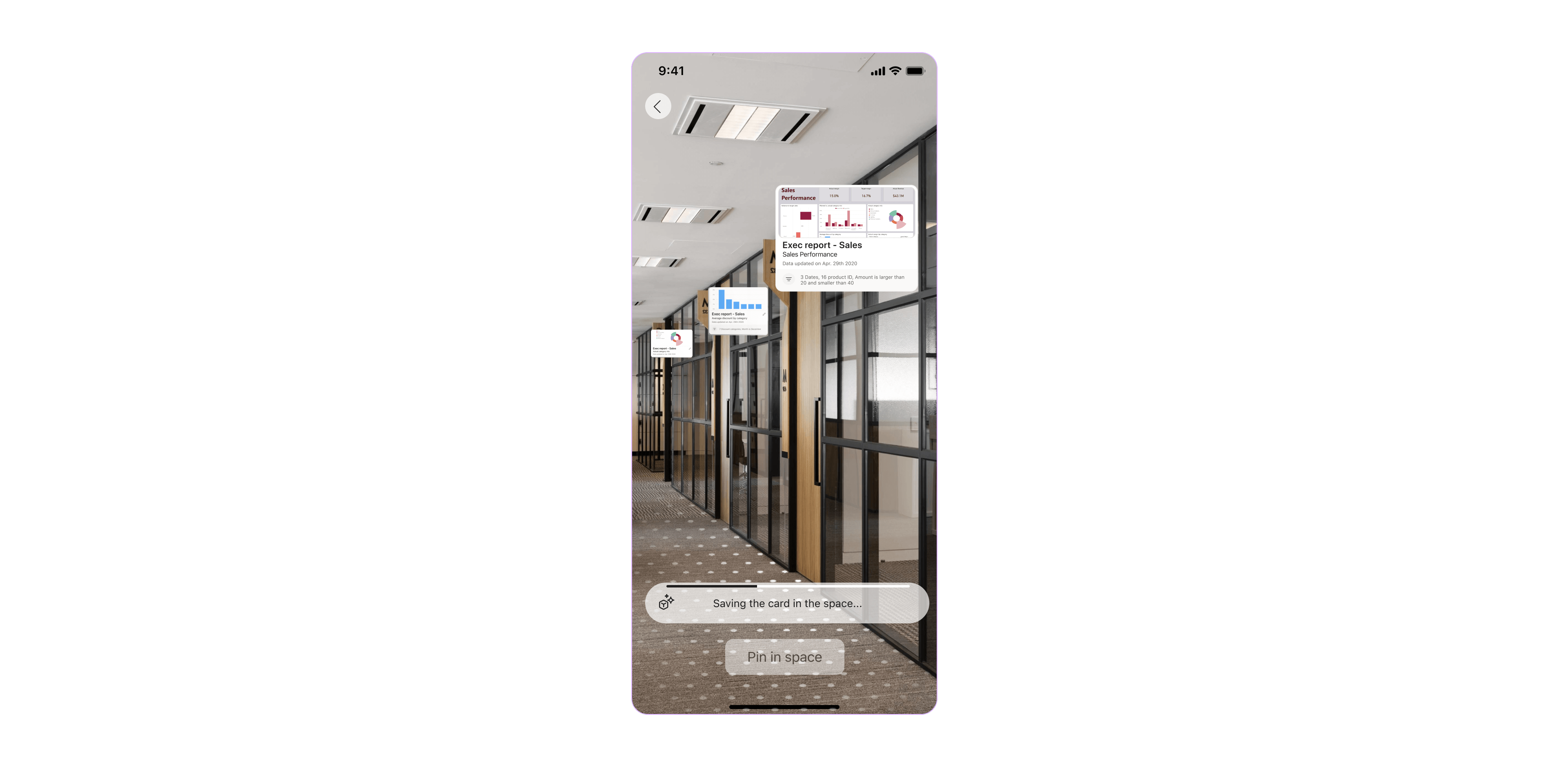
When ׳Pinning׳ in space, the user places, adjusts and saves the reports in the physical location. This is a playground for the user to interact with the 3D report object and save it in the space.
The pinning experience should both convey its abilities and guide the user to successful task completion. These key elements followed me throughout the design process of pinning report card, layout and user flow.
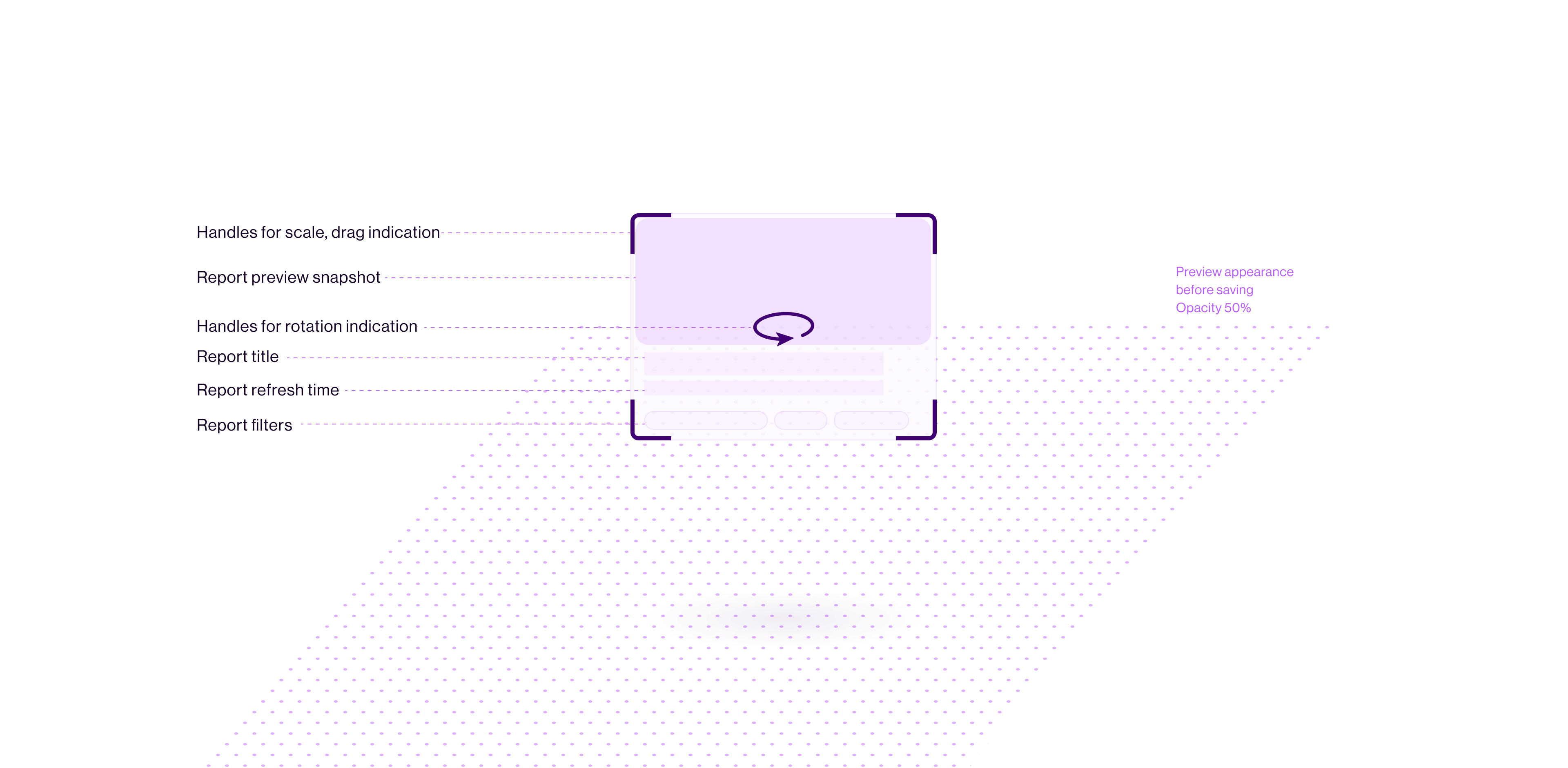
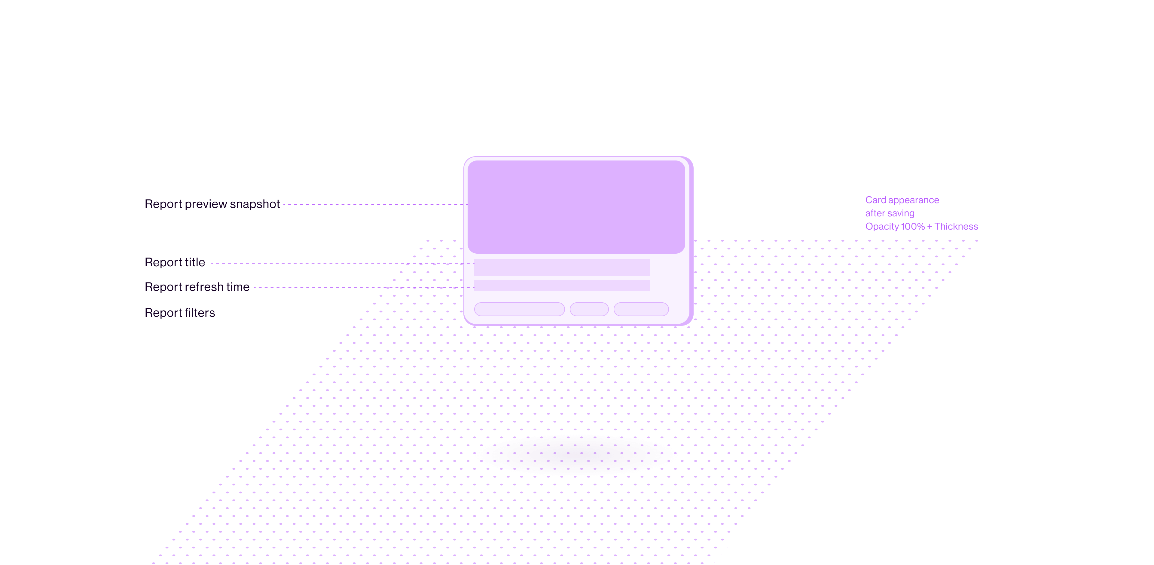
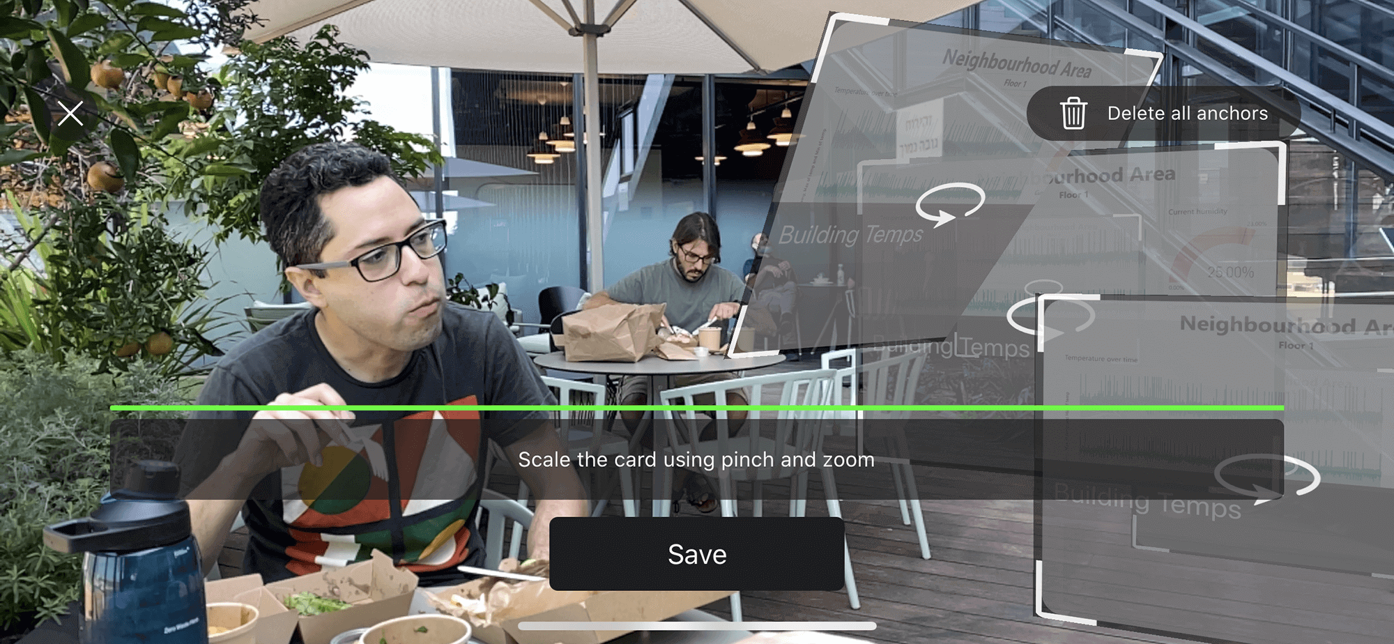
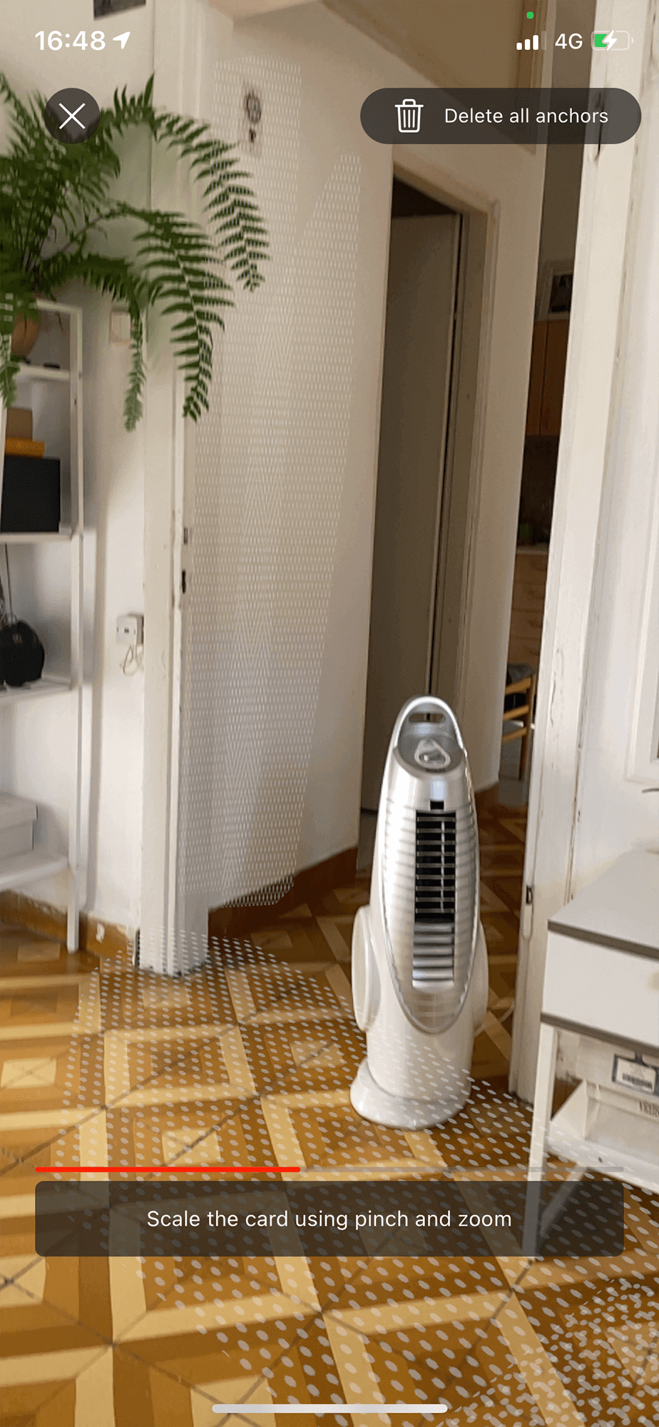
Report CardThe report card in the ׳Pinning׳ mode, is a representation of the data item that will appear in the space after saving its location - ׳Ghost׳ appearance. The card can be adjusted (drag, scale, rotate) by the user and then saved to the space.
The report card in the ׳Pinning׳ mode, is a representation of the data item that will appear in the space after saving its location - ׳Ghost׳ appearance. The card can be adjusted (drag, scale, rotate) by the user and then saved to the space.
In order to achieve an intuitive experience, the card visualization had to convey these functionalities.
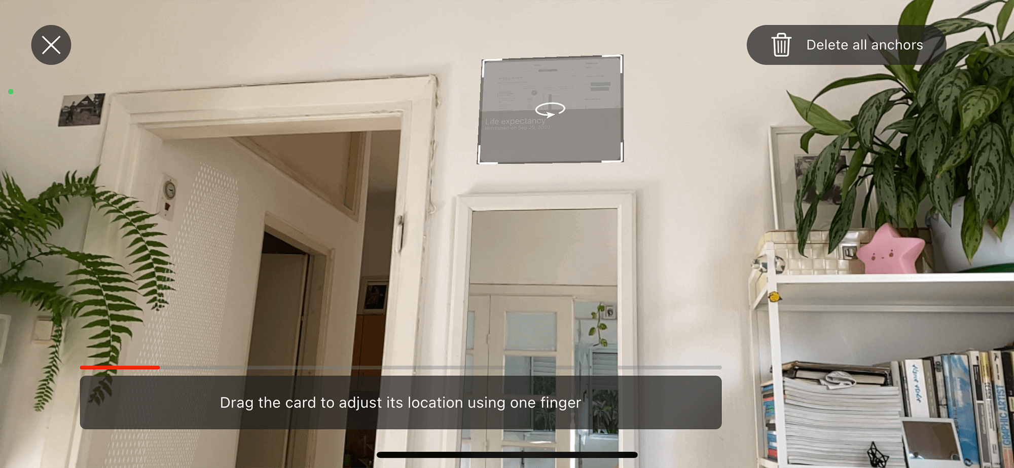
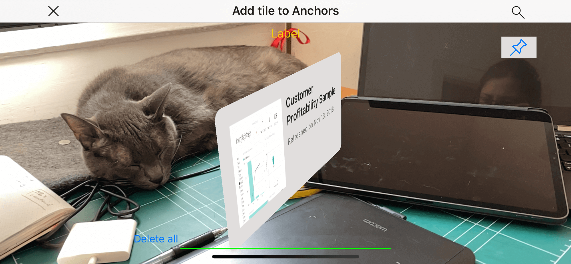
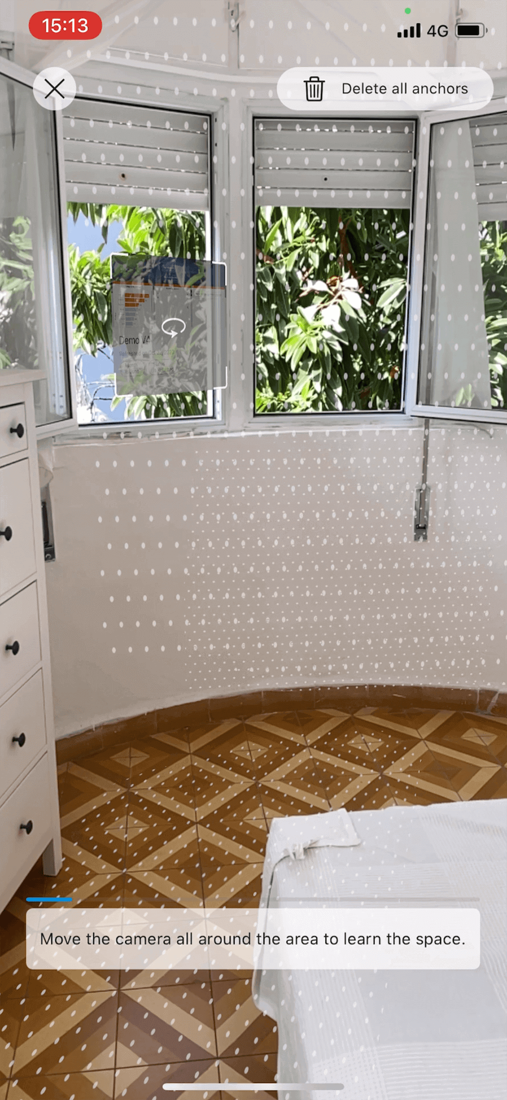
Pinning LayoutWhen ׳Pinning׳, the user is presented with a graphical layer in the physical space:
When ׳Pinning׳, the user is presented with a graphical layer in the physical space:
- ׳Ghost׳ card of the report
-
Grid for visual mapping of the surfaces in the space
- Buttons, banners and a progress bar for user guidance


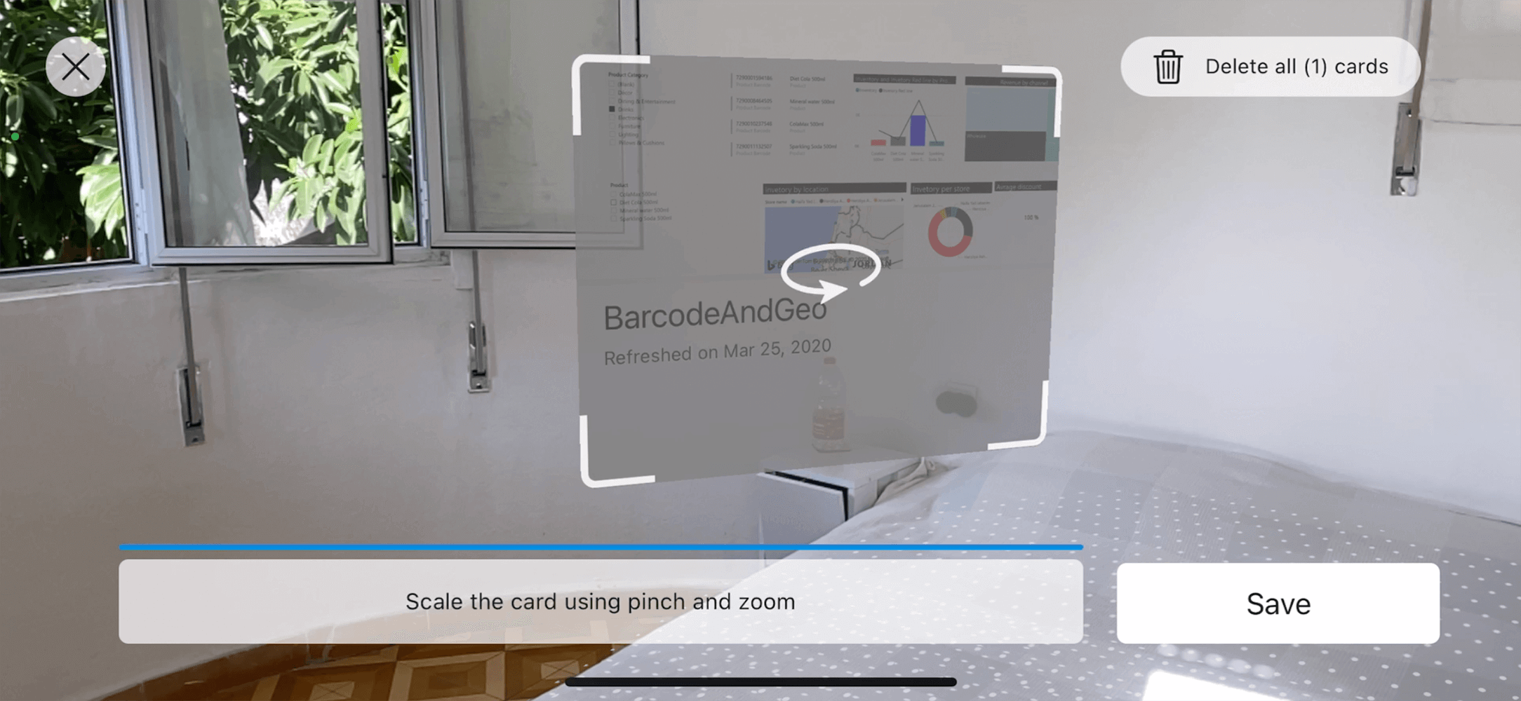
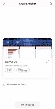
Pinning FlowThe user enters the ׳Pinning׳ mode through the report he/she wants to ׳pin׳. A preview screen of the report card is shown - the user can edit the state of the card, change the name and decide whether filters should be applied in the pinned report.
The user enters the ׳Pinning׳ mode through the report he/she wants to ׳pin׳. A preview screen of the report card is shown - the user can edit the state of the card, change the name and decide whether filters should be applied in the pinned report.
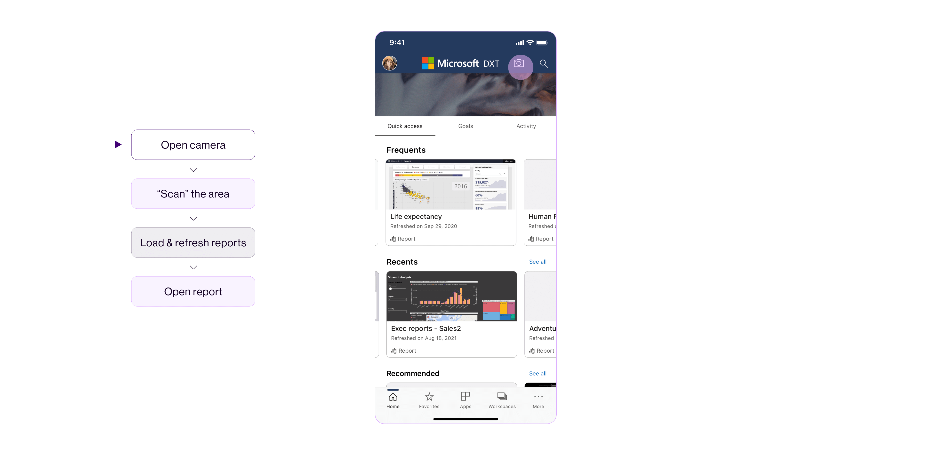
׳Pin in Space׳ button opens the device camera and displays the pinning graphical layer in the physical space.


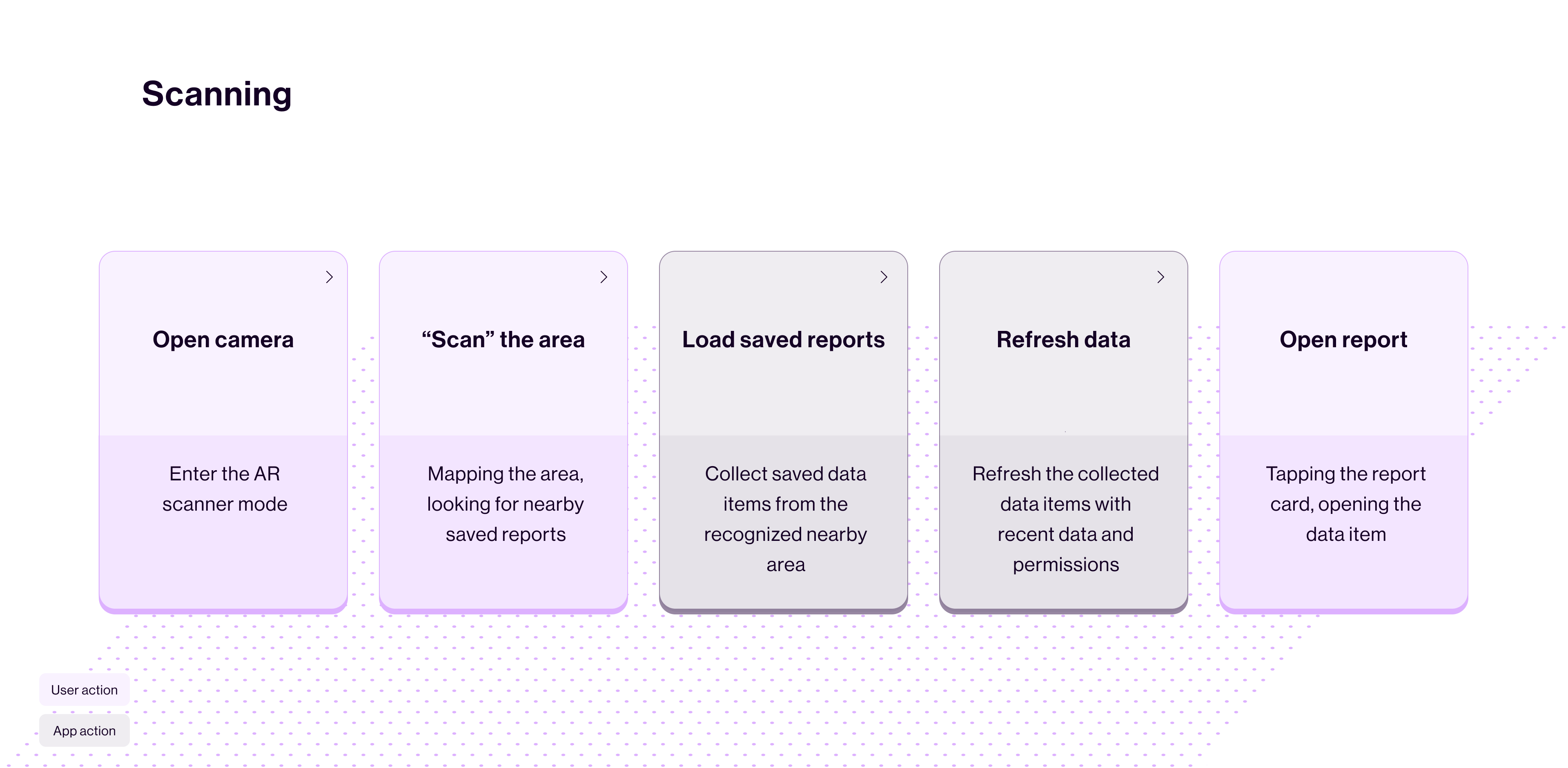
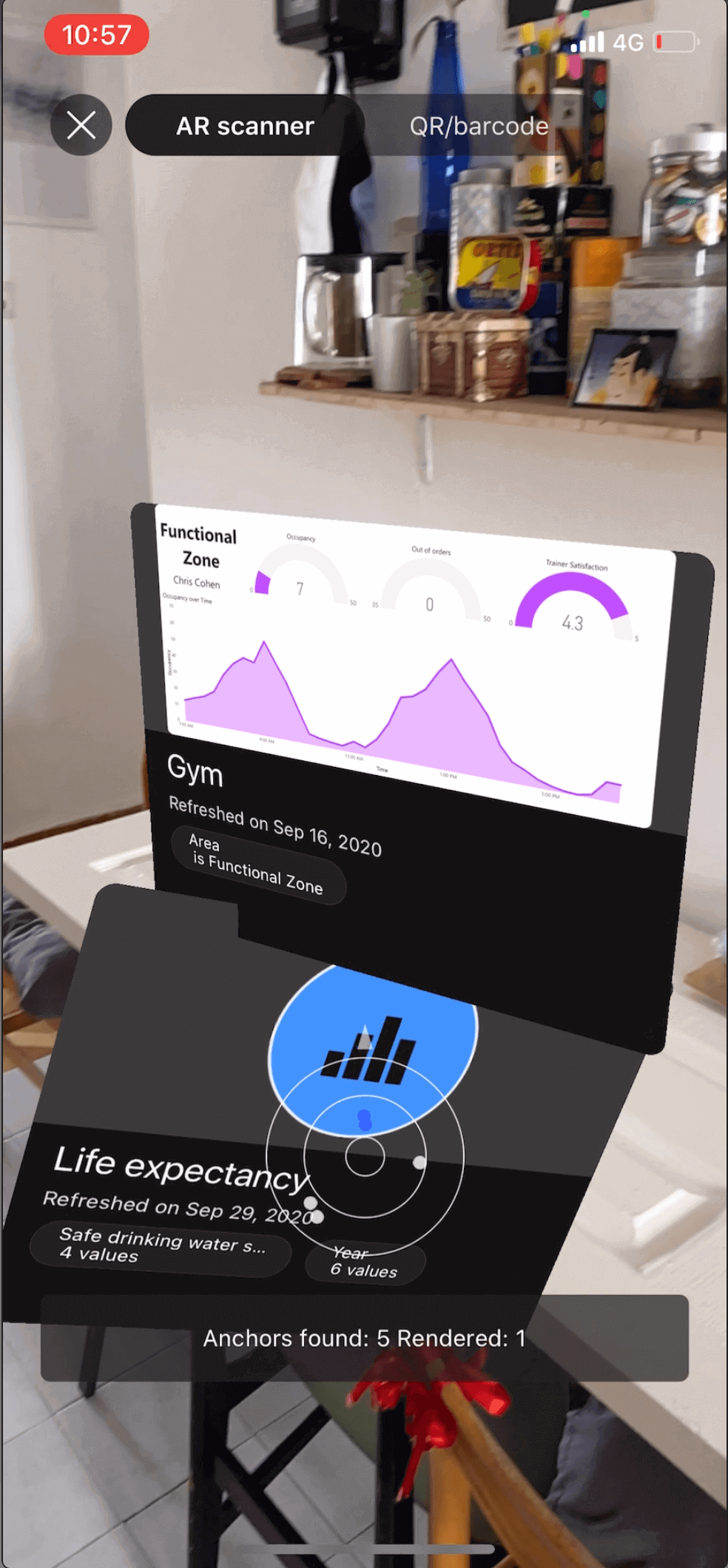
Data in Space Scanning flow: Scanning the Gym space to find reports in the relevant areas (free weight, cardio, etc..).
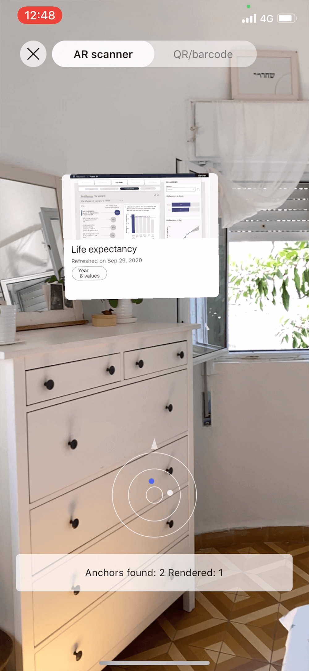
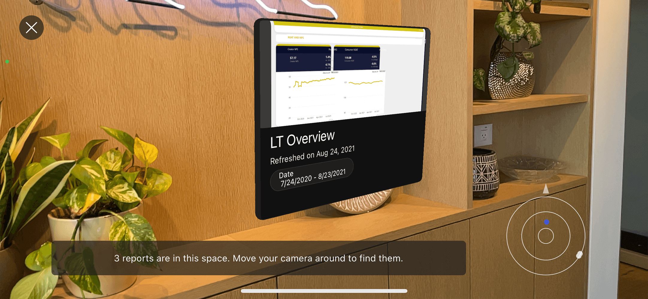
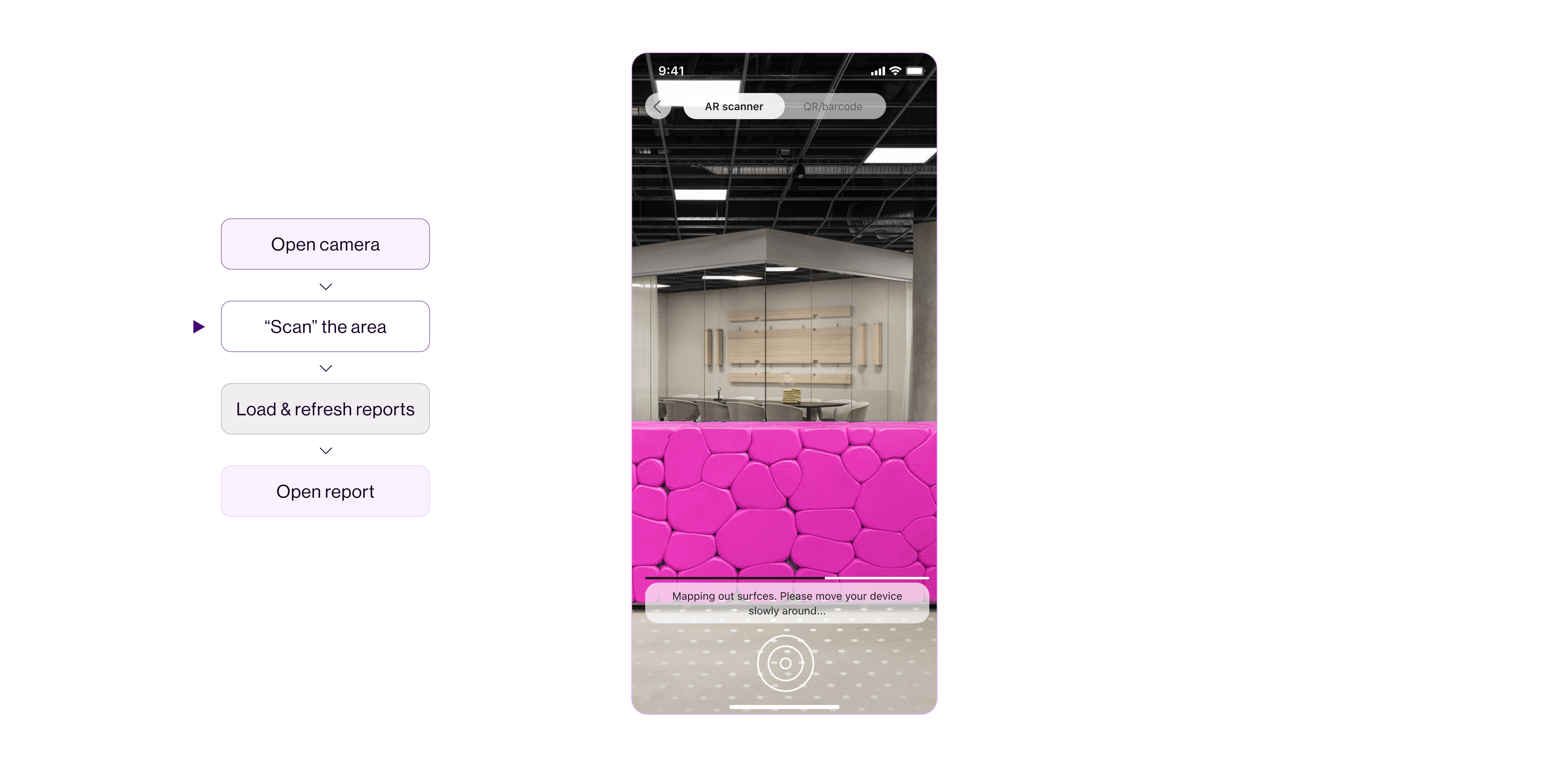
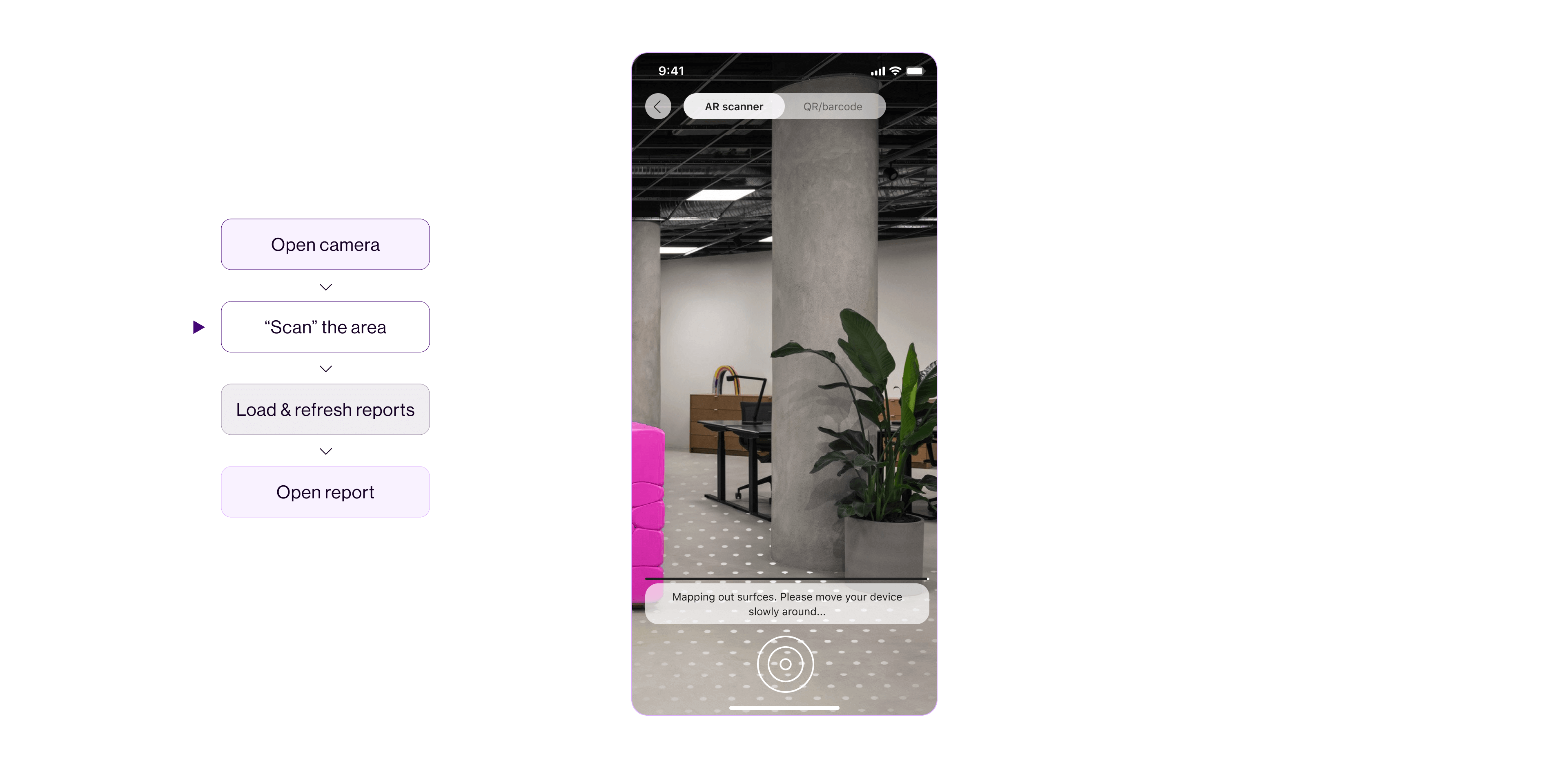
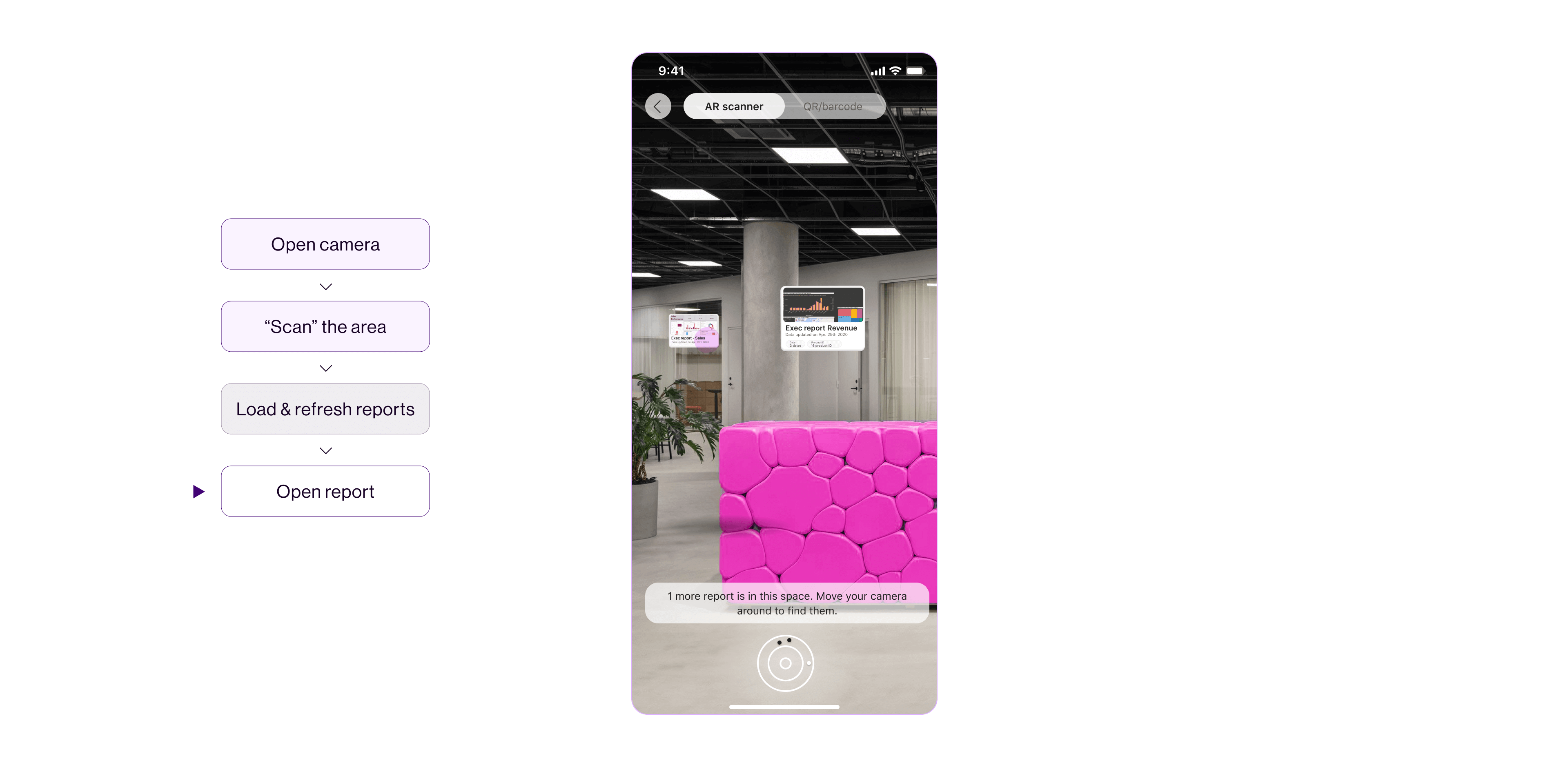
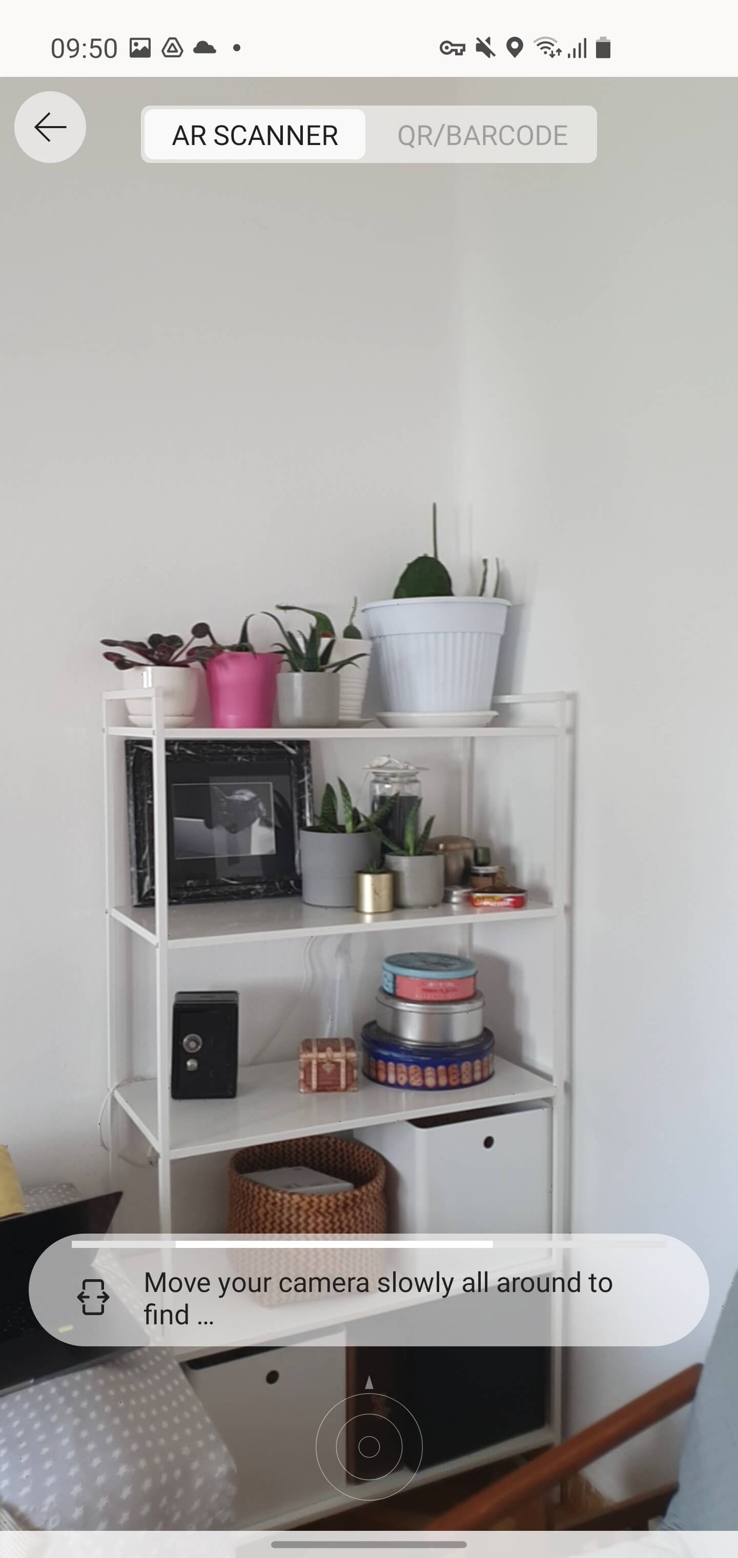
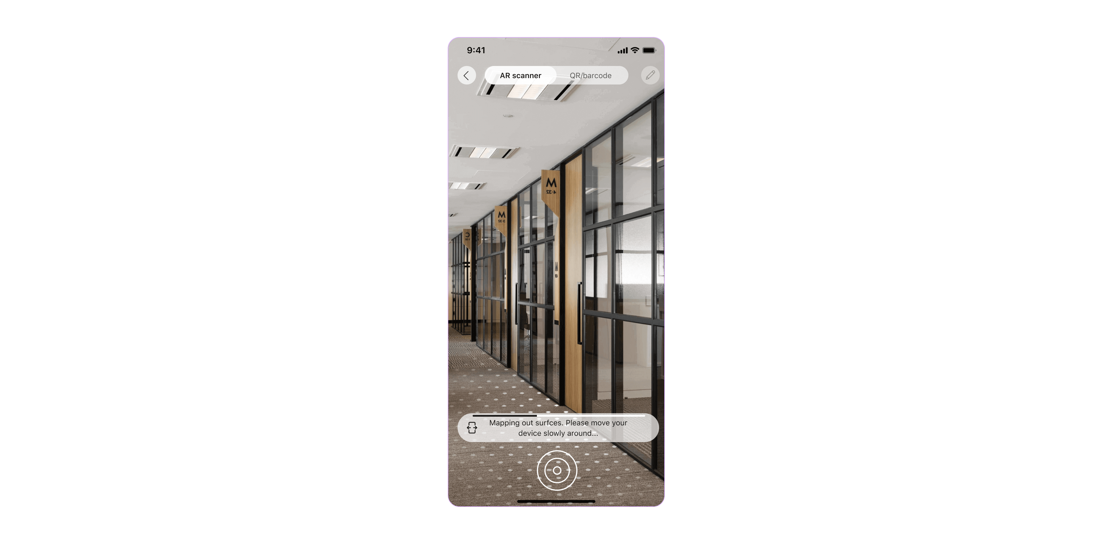
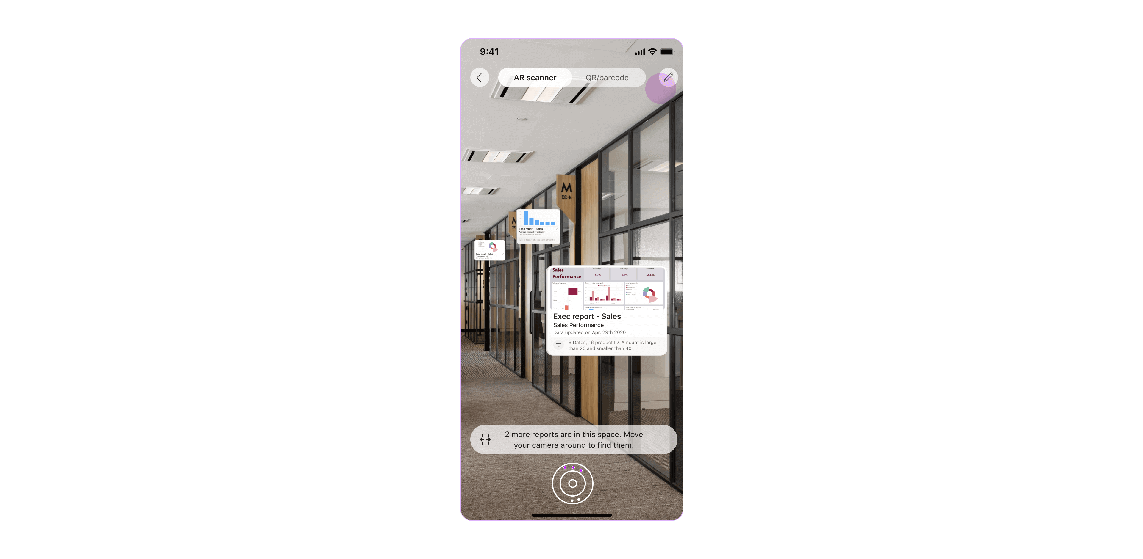
When ׳Scanning׳ in space, the user searches for the saved reports in the physical area. Successful orientation and understanding of the scanning process are imperative for user success.
The scanning experience should guide the users to the location of the nearby saved reports and carry them through until finding the relevant one. These principles were in mind throughout the design process of the scanning report card, layout and user flow.
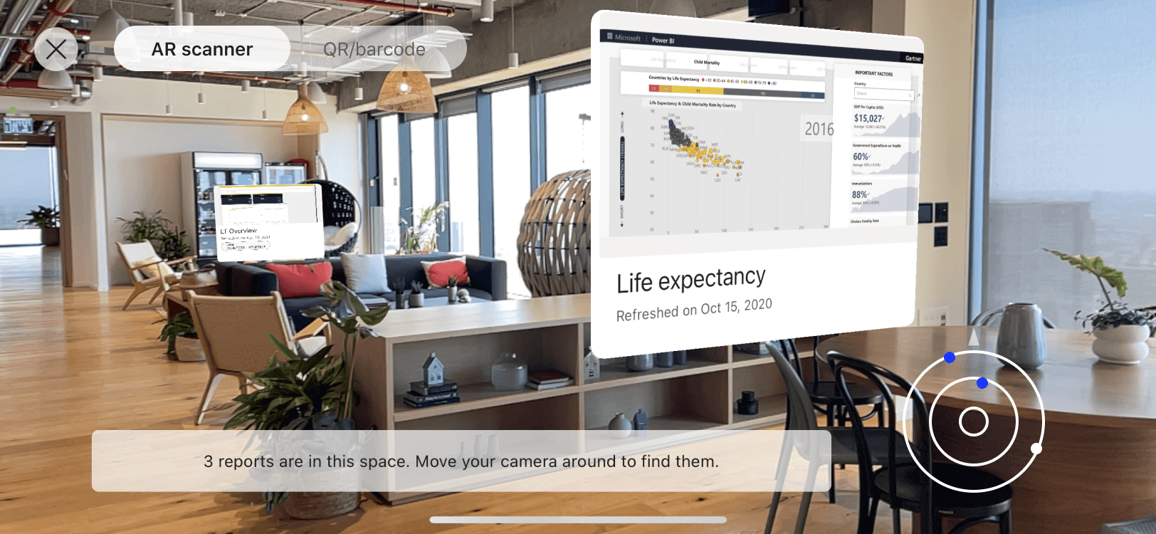
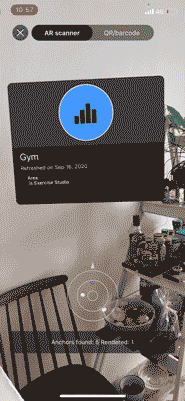
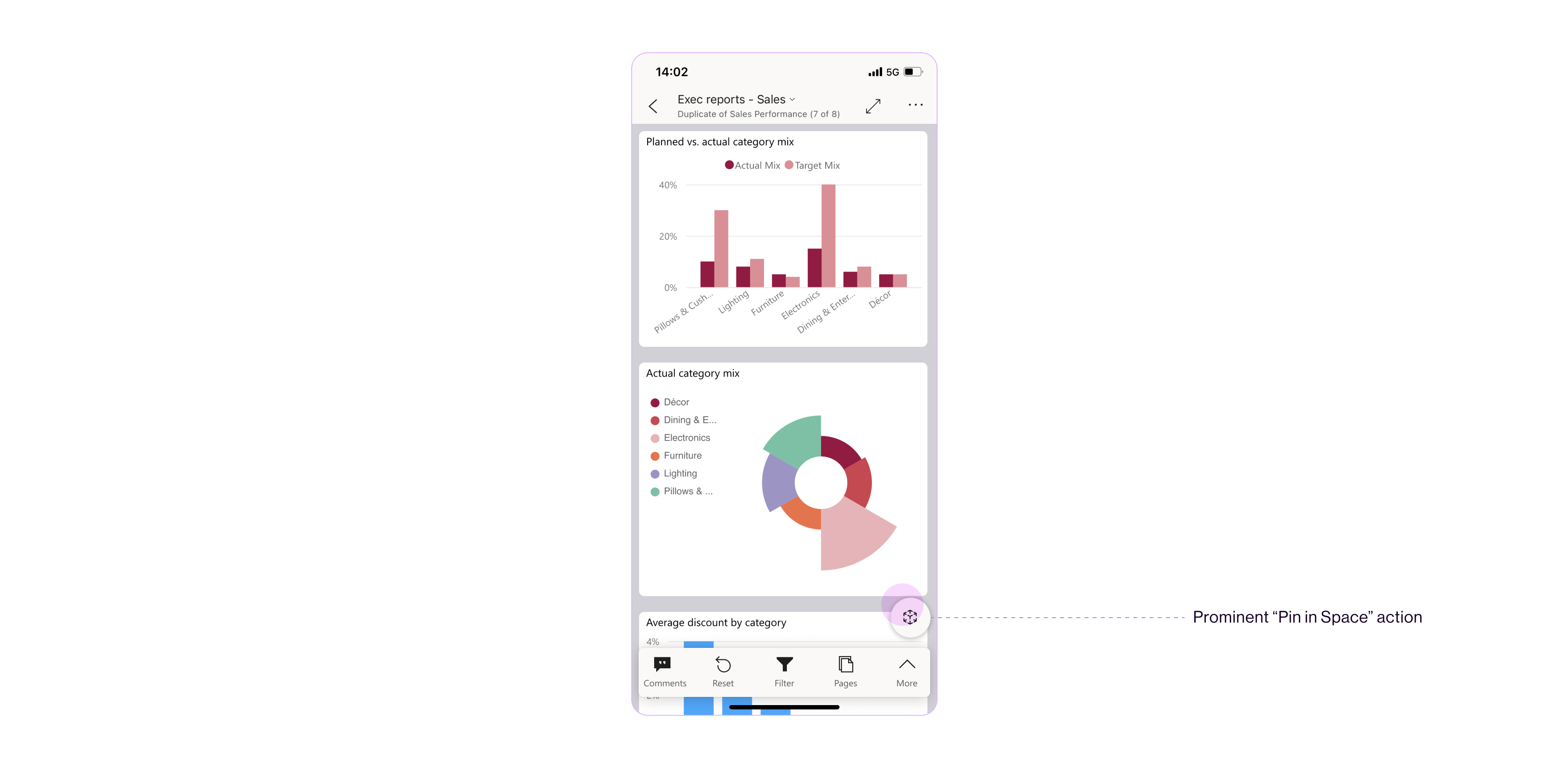
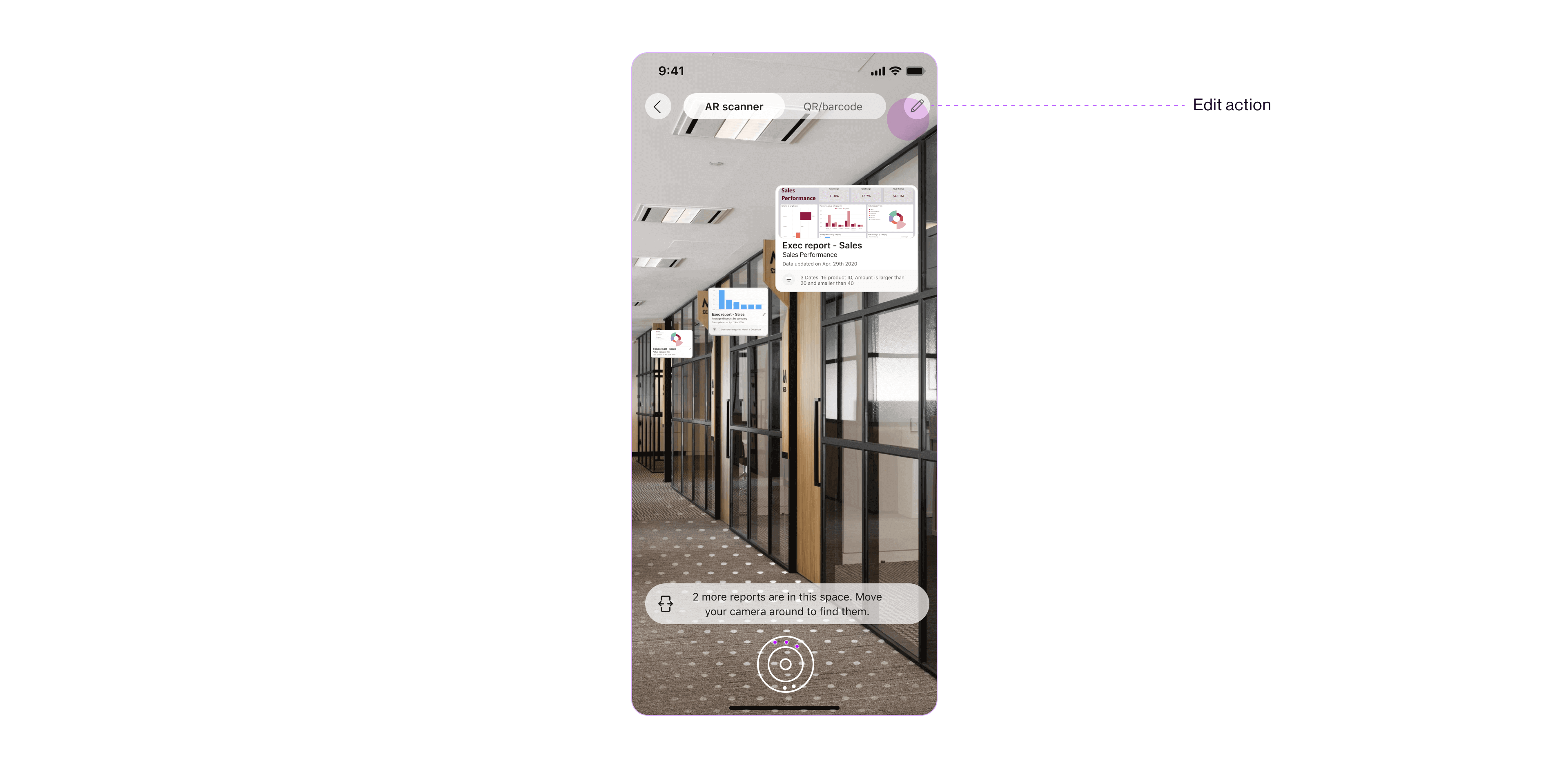
Report CardWhile the report card in the ׳Pinning׳ mode is editable, in the ׳Scanning׳ mode, it is the representation of the report itself. It displays the most updated data, in the report screenshot, refresh time and applied filters.
While the report card in the ׳Pinning׳ mode is editable, in the ׳Scanning׳ mode, it is the representation of the report itself. It displays the most updated data, in the report screenshot, refresh time and applied filters.
The card is a 3D opaque object that invites the user to tap and interact with it.
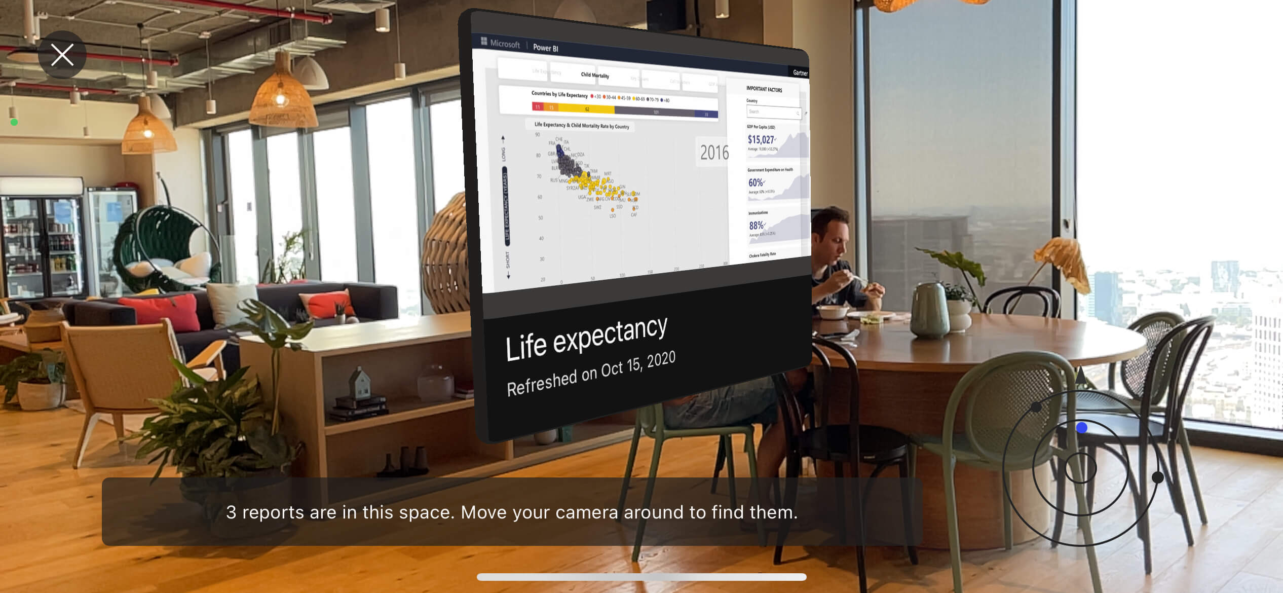
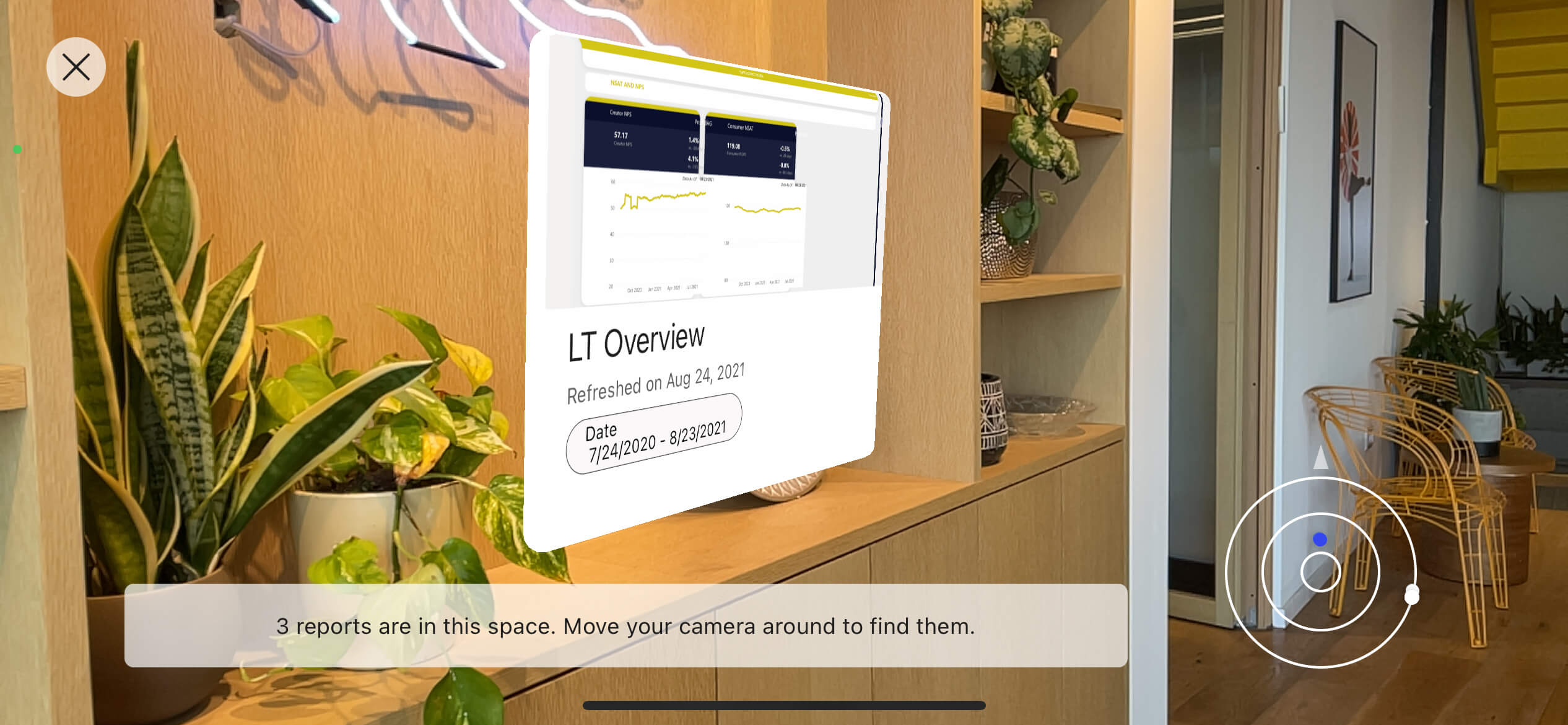
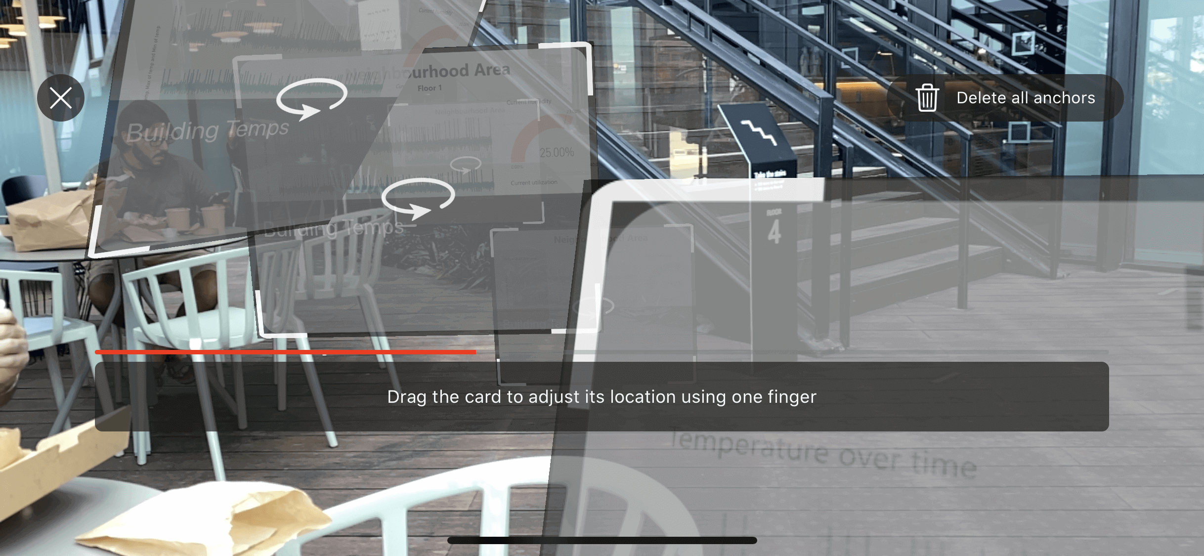
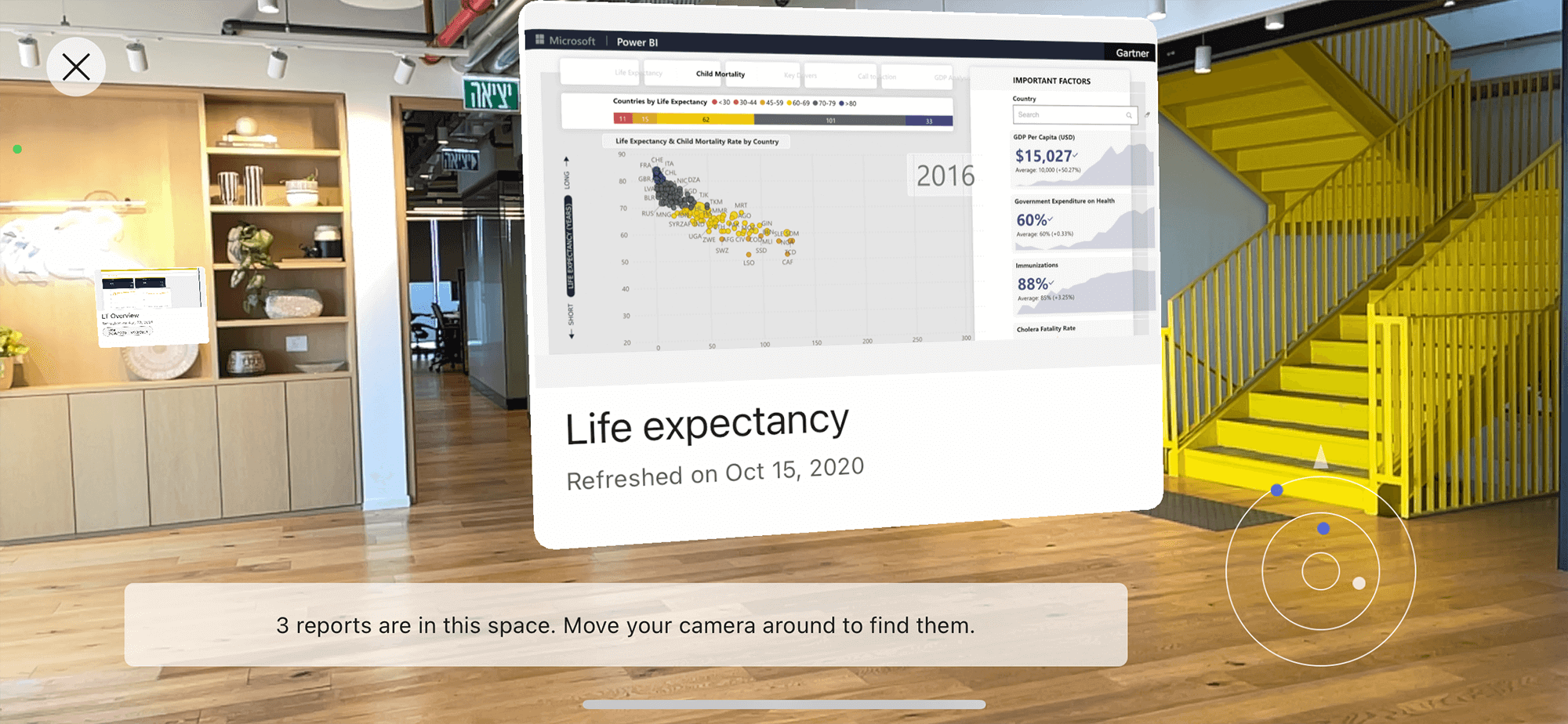
Scanning LayoutWhen ׳Scanning׳, the user is guided to find the nearby pinned reports through a graphical layer in the physical space:
When ׳Scanning׳, the user is guided to find the nearby pinned reports through a graphical layer in the physical space:
- 3D card of the report
- Grid for visual mapping of the surfaces in the space
- Banners and a progress bar for user guidence
- Radar that displays the reports׳ location in the space - each dot in the radar represents a report found in the nearby area. The radar assists to the orientation in the physical environment.
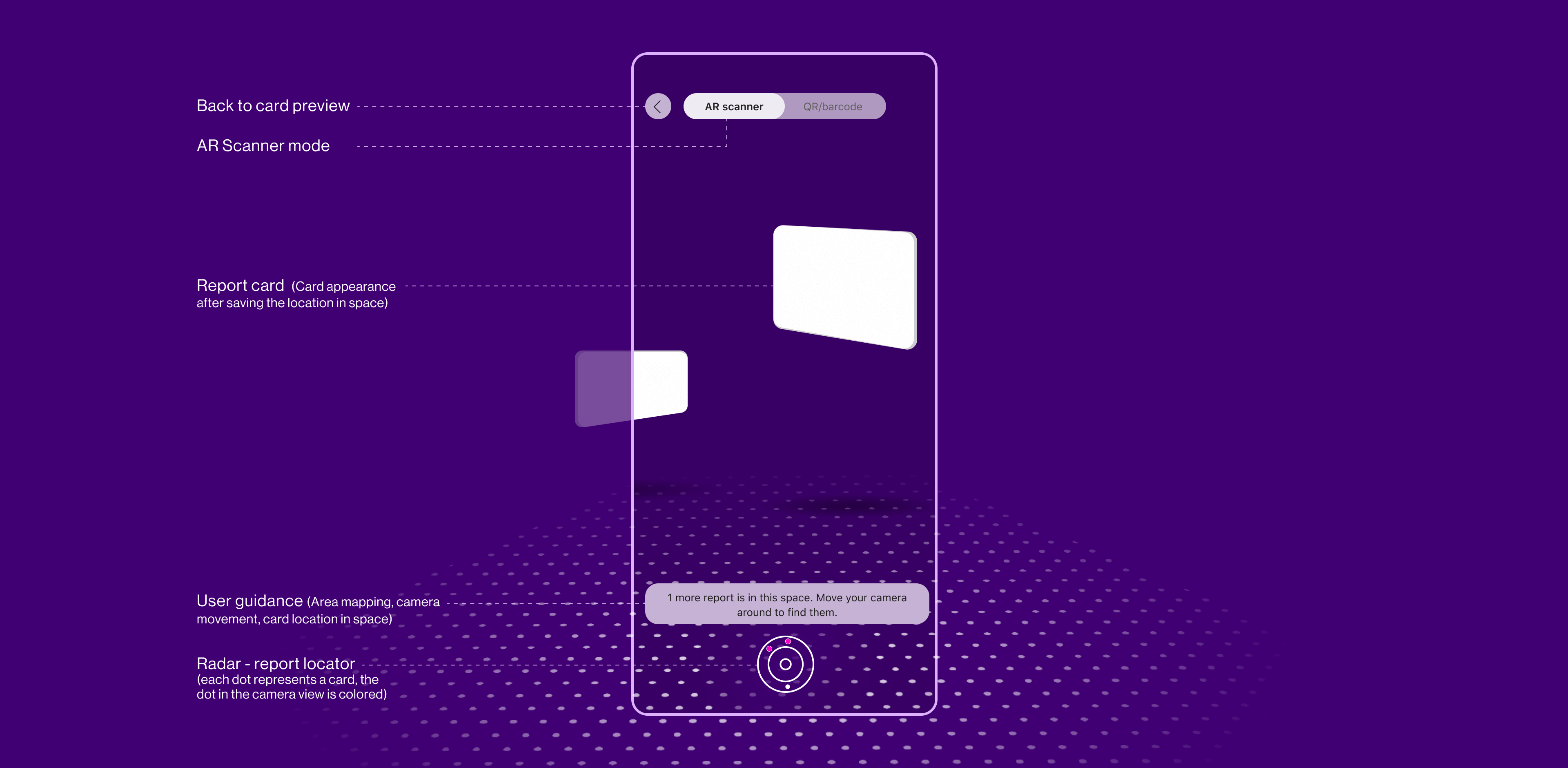

Scanning Flow
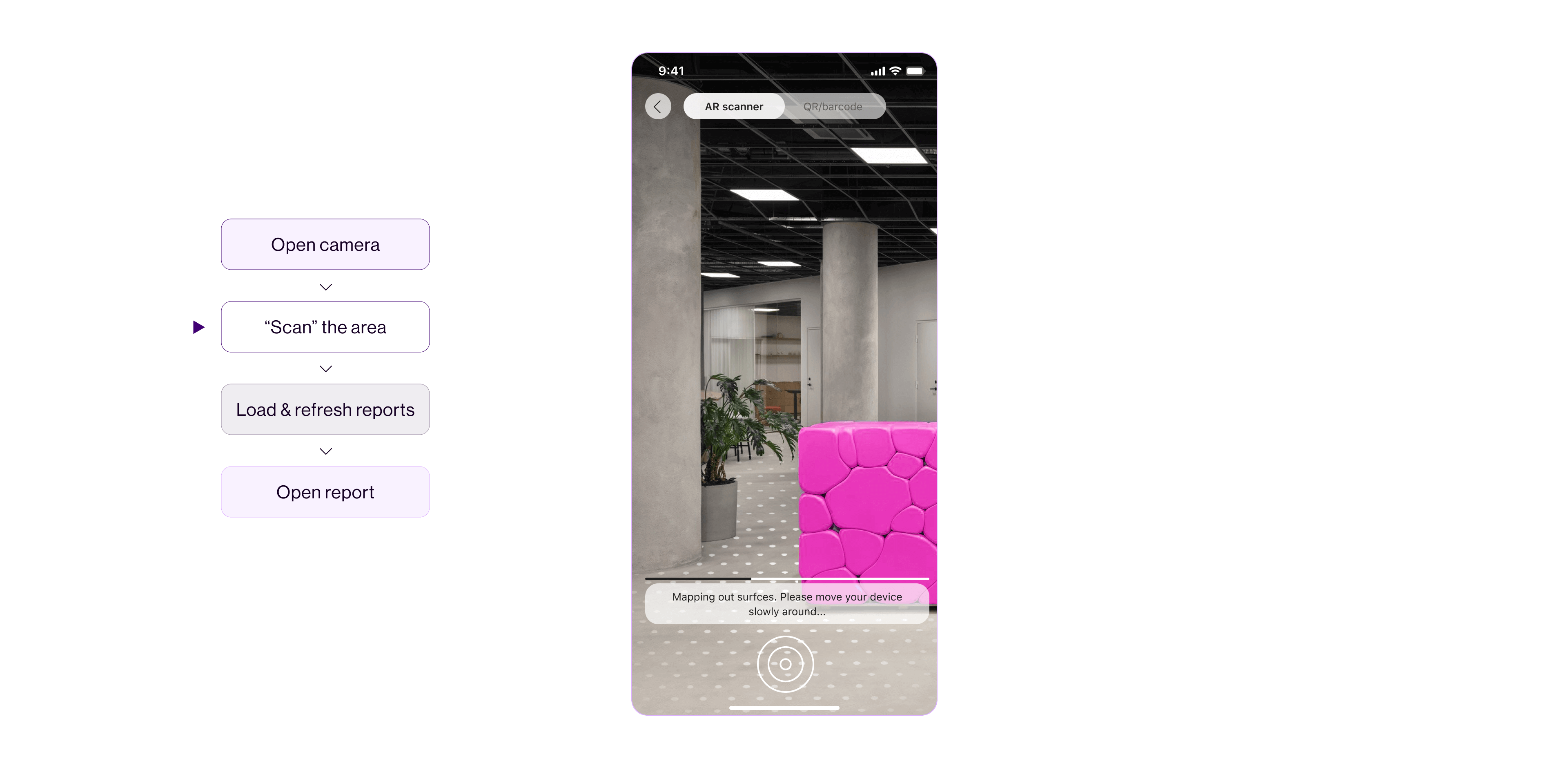
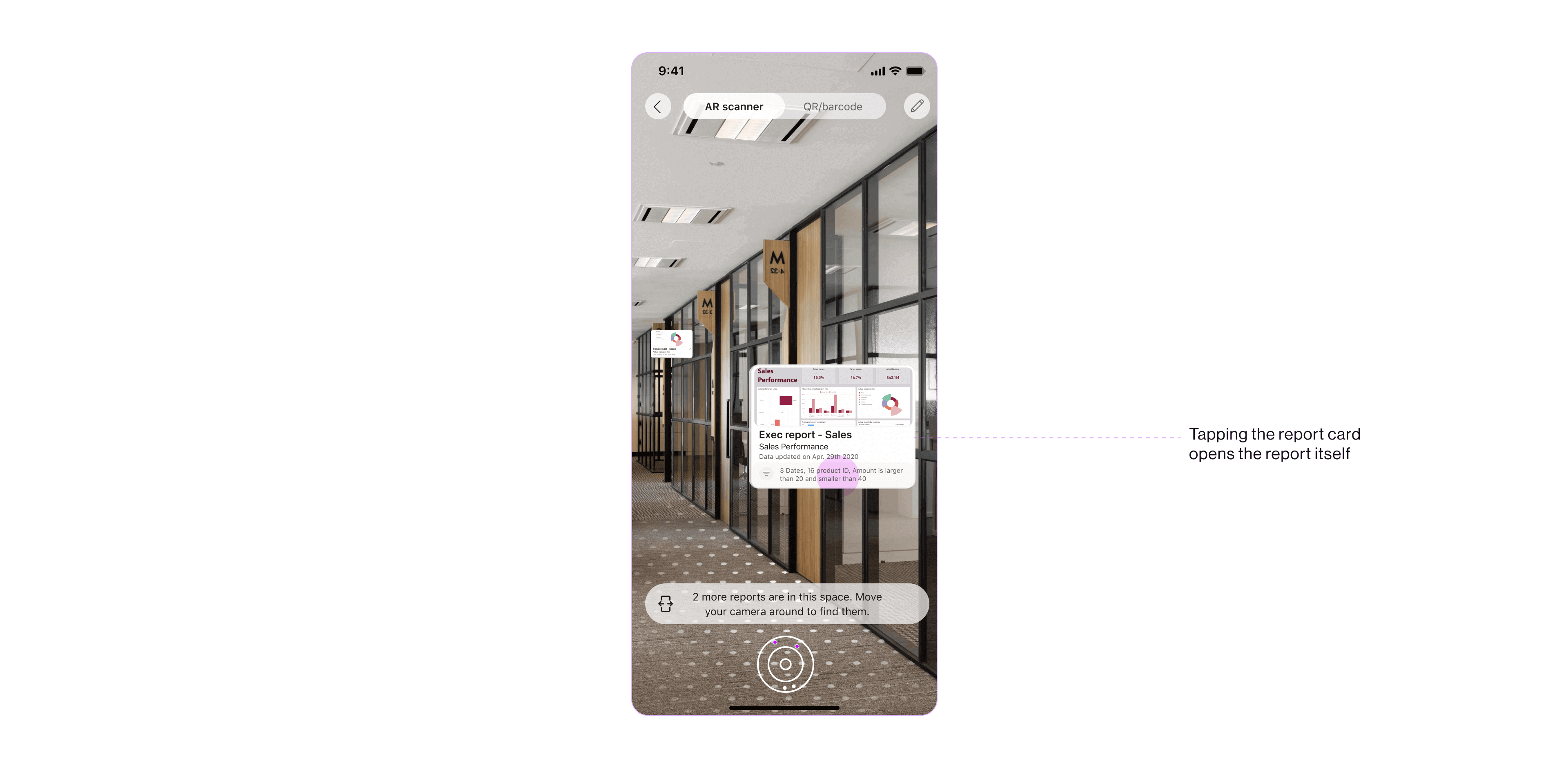
The user enters the ׳Scanning׳ mode by opening the app camera. A mapping process of the environment is initiated. When the surfaces are mapped and recognized, the reports in that physical area (and nearby areas) are displayed to the user both in the camera view and in the radar as dots. Tapping one of the cards, opens the report it represents.


︎
![Report card in "Pinning" mode. Test build with multiple appearances of the same card.]()
![Report card in "Scanning" mode. Test build with multiple appearances of the same card.]()
Creating the ׳Data in Space׳ experience was a journey of discovering a new technology, learning how to leverage its limitations and fulfilling its potential by breathing into its real-life needs.
Opportunities
Data in Space

Creating the ׳Data in Space׳ experience was a journey of discovering a new technology, learning how to leverage its limitations and fulfilling its potential by breathing into its real-life needs.
After experimenting with ׳Spatial Anchoring׳ (the technology ׳Data in Space׳ is based upon), it was clear that the challenges the experience should address are user understanding of a new interaction model and user guidance for easy adoption.


User Understanding
To that extent, the report card was designed to indicate the types of interactions that can be applied to it, and the opacity of the card was reduced to suggest it’s editable.
׳Data in Space׳ is a new type of interaction for the Power BI Mobile users. To achieve a successful journey, users need to understand how to interact with the report card in the physical space, and comprehend that the surfaces in the camera POV are mapped and a part of the experience.
׳Data in Space׳ is a new type of interaction for the Power BI Mobile users. To achieve a successful journey, users need to understand how to interact with the report card in the physical space, and comprehend that the surfaces in the camera POV are mapped and a part of the experience.
To that extent, the report card was designed to indicate the types of interactions that can be applied to it, and the opacity of the card was reduced to suggest it’s editable.

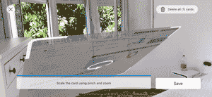
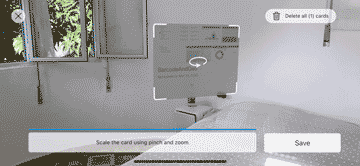
A layer of graphic dots were added to the mapped surfaces in the physical area, to visually convey that there is an immersive experience happening at this moment and to provide the users with an indication to which point in space the card is being associated.
User Guidance
An intuitive experience, in which users can progress freely to task completion, requires clear guidance.
An intuitive experience, in which users can progress freely to task completion, requires clear guidance.
For business users meeting an AR experience is not a matter of habit: understanding the actions they should perform and orienting in the physical space with AR should be supported by design.
User guidance was a dominant aspect in the design: elements like ׳help׳ banners, progress bar, and buttons that became active in context guided the users through the ׳Pinning׳ and ׳Scanning׳ flows.
A radar was created in the ׳Scanning׳ mode to help the users better orient in the space and find the AR objects saved in the nearby area.
The radar displays a dot for every report card found in the space, colors the dots of the cards that are in the camera view, and moves with the camera movement.

These days I am designing the next version of ׳Data in Space׳. Insights and learnings from the POC are implemented to enhance and enrich the experience and user engagement.
Public Preview of Data in Space for iOS - fresh from the oven:)
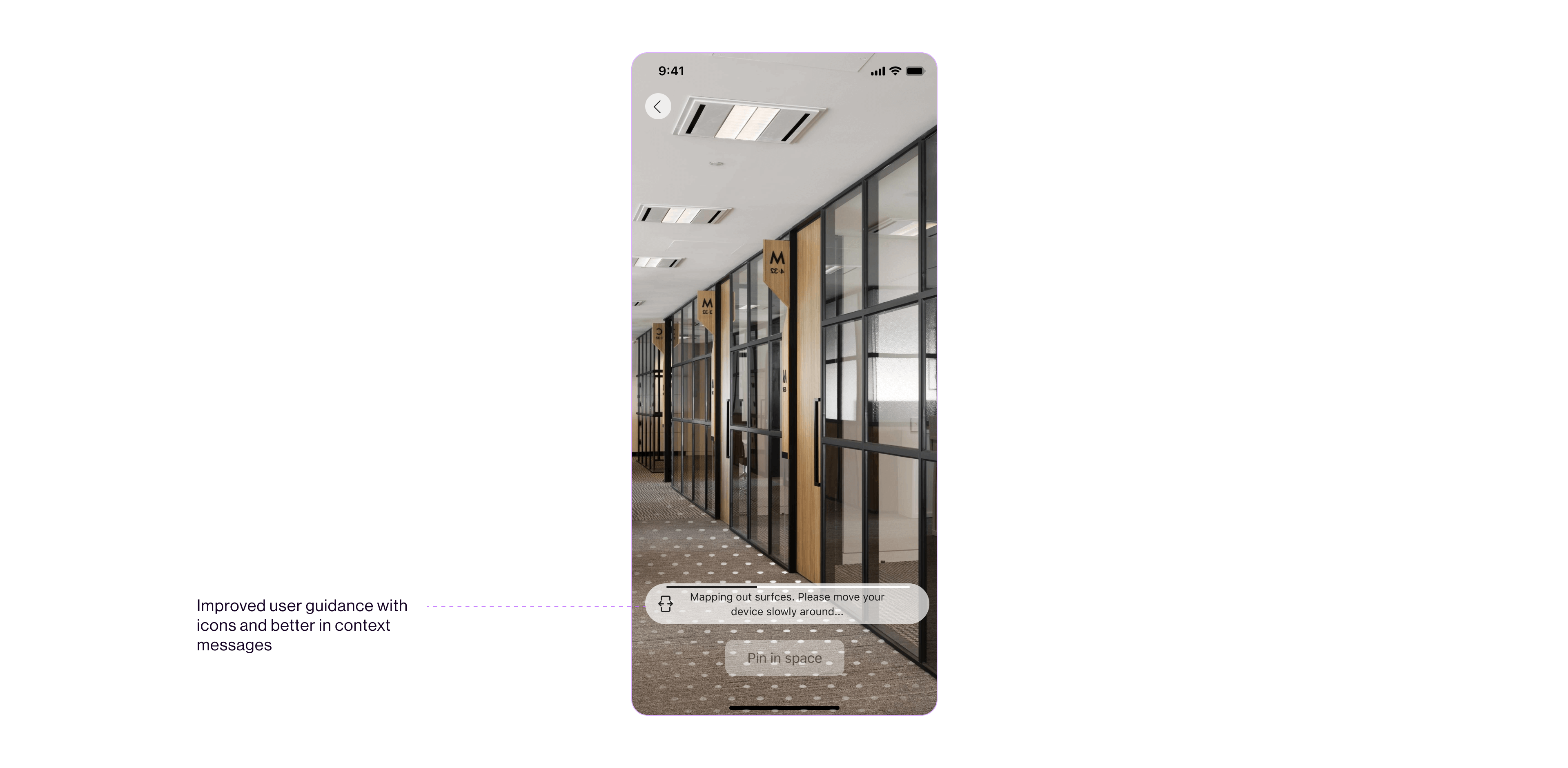
Intro experience with guiding text and animation was added to the ׳Pinning׳ flow for better understanding of the interactions with the report card.

The messages in the guiding banners were improved and icons were added to enhance understanding of the instruction in the banner.
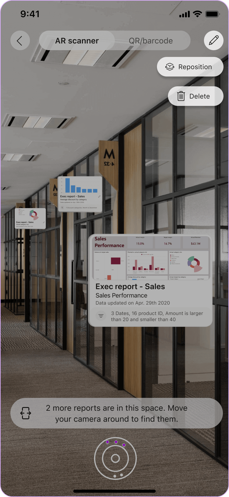
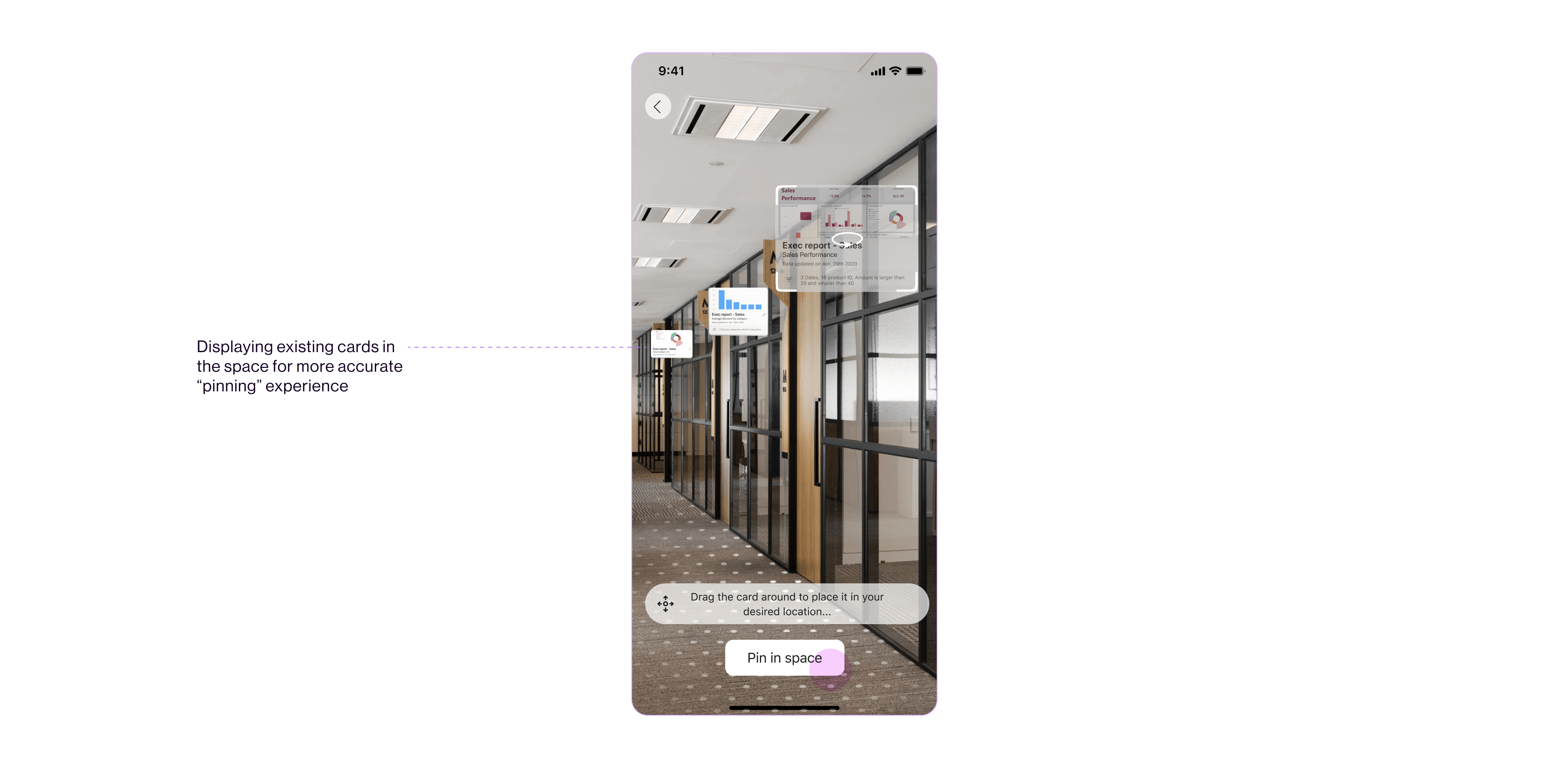
While ׳Pinning׳, the user can now see other saved report cards in the space. In the previous version, users could see all the reports in the space while scanning.
This is a major enhancement that helps the users ׳pin׳ cards in relation to other cards and avoid placing them one on top of another.


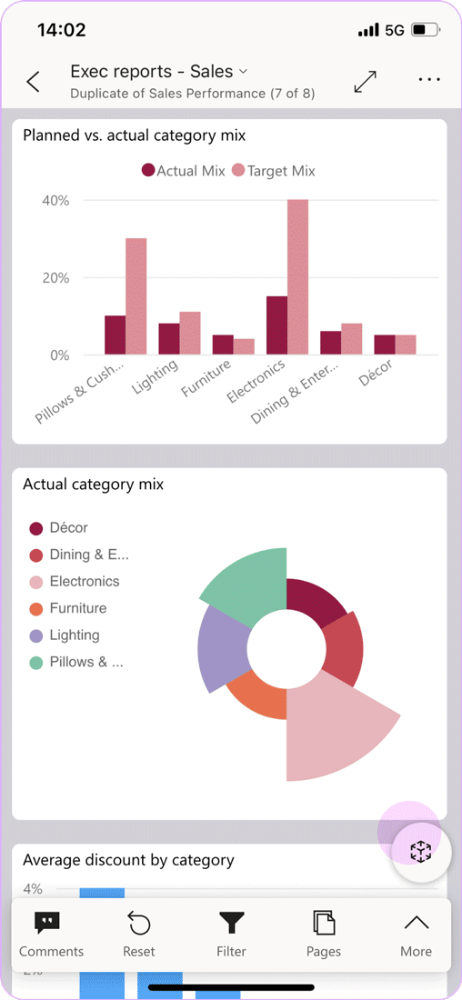
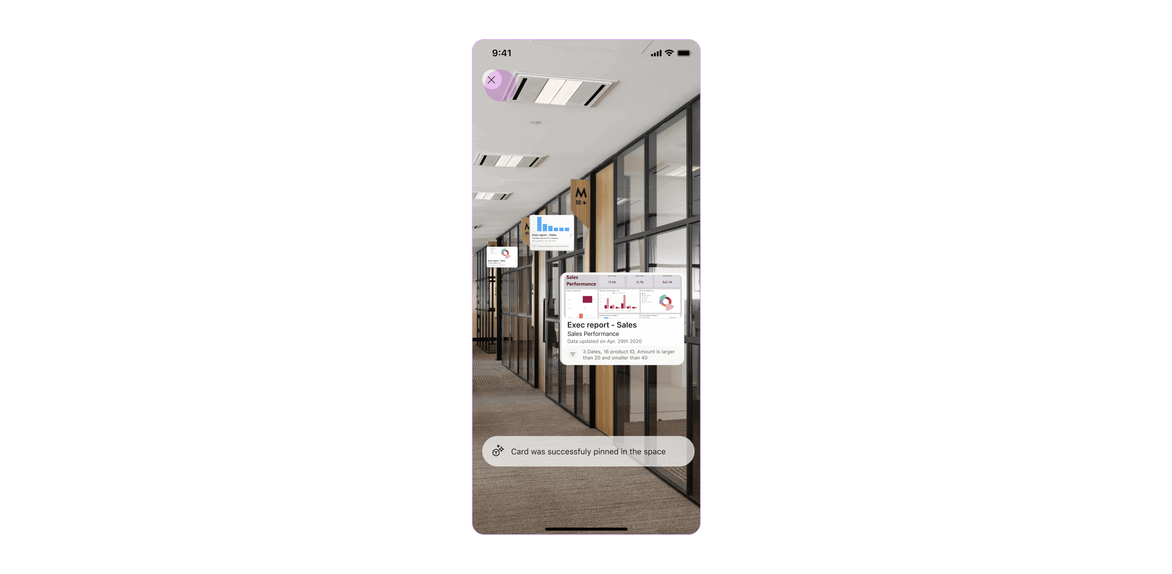
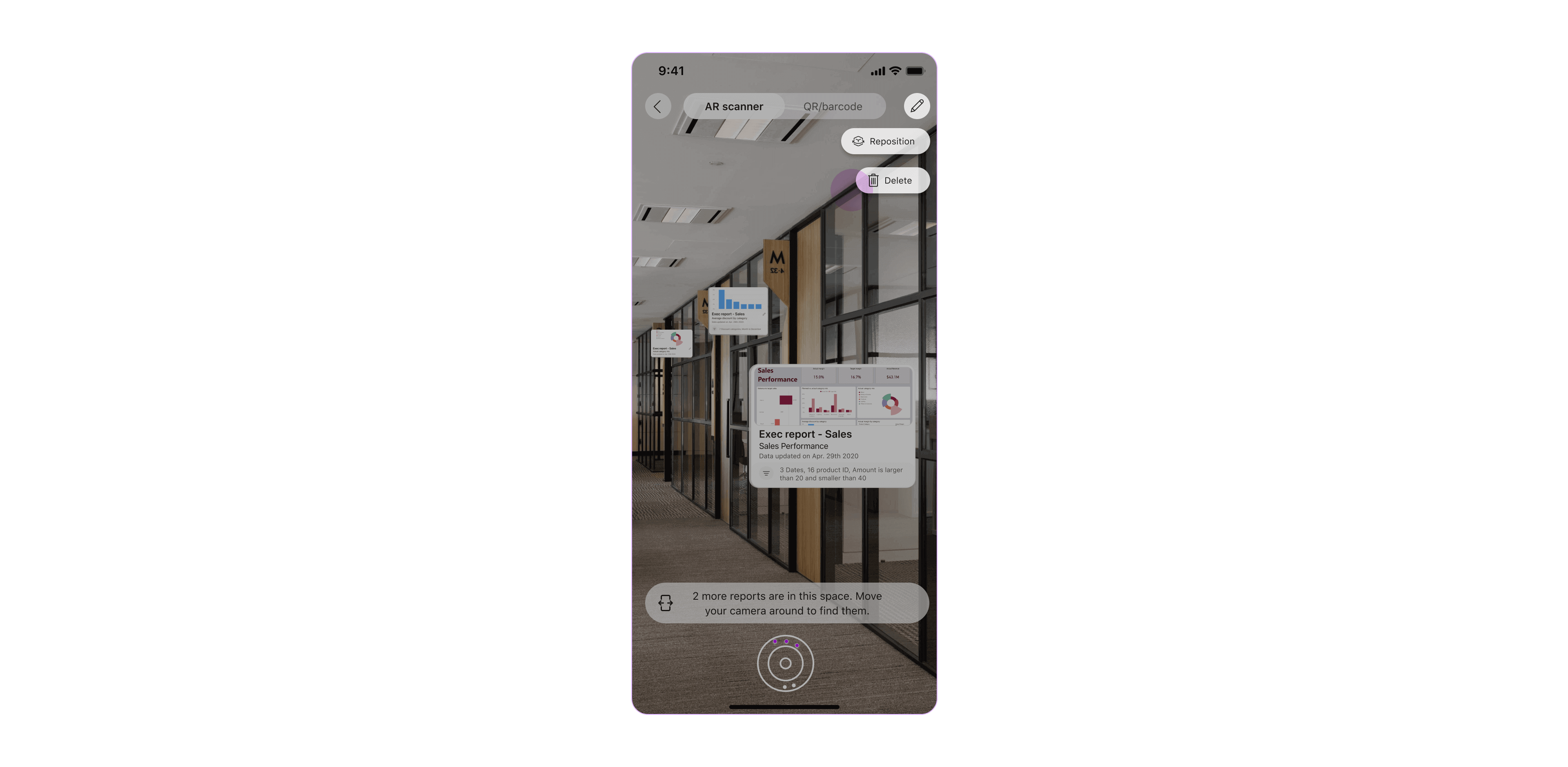
Editing capabilities were added to the ׳Scanning׳ mode, to allow users more flexibility and functionality to adjust the report cards in the environment.
Pinning Flow
The ׳Pinning׳ flow includes a more prominent entry point to the ׳Data in Space׳ experience, the report card is more refined, and the user guidance was greatly enhanced with intro carousel and richer banners.
The ׳Pinning׳ flow includes a more prominent entry point to the ׳Data in Space׳ experience, the report card is more refined, and the user guidance was greatly enhanced with intro carousel and richer banners.


Scanning Flow
The ׳Scanning׳ flow provides editing functionality of repositioning and deleting the report cards in the space, for richer user experience and more accurate position in the physical space.


Stay tuned for more updates about the next experience of ׳Data in Space׳ ;)